Using the Workflow Builder
This section identifies the many features and functions in the Workflow Builder.
Menus
The menus, listed by name across the top of the screen, include File, Edit, View, Insert, Shapes, Project and Help.
Menu Bar Icons
Just beneath the written menus, there are icons which perform some of the more commonly used functions, including: New, Open, Save, Save As…, Print, Export, Cut, Copy, Paste, Delete, Undo, Redo, Validate, Unlock Demo Options, Full Screen, and Help.

Additional Features
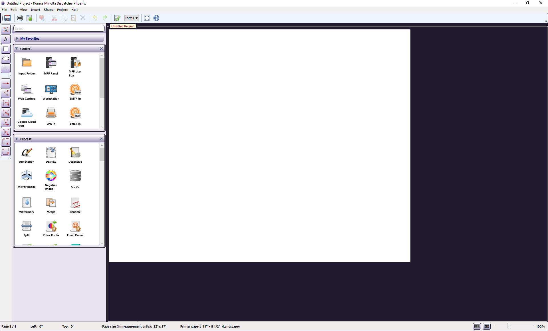
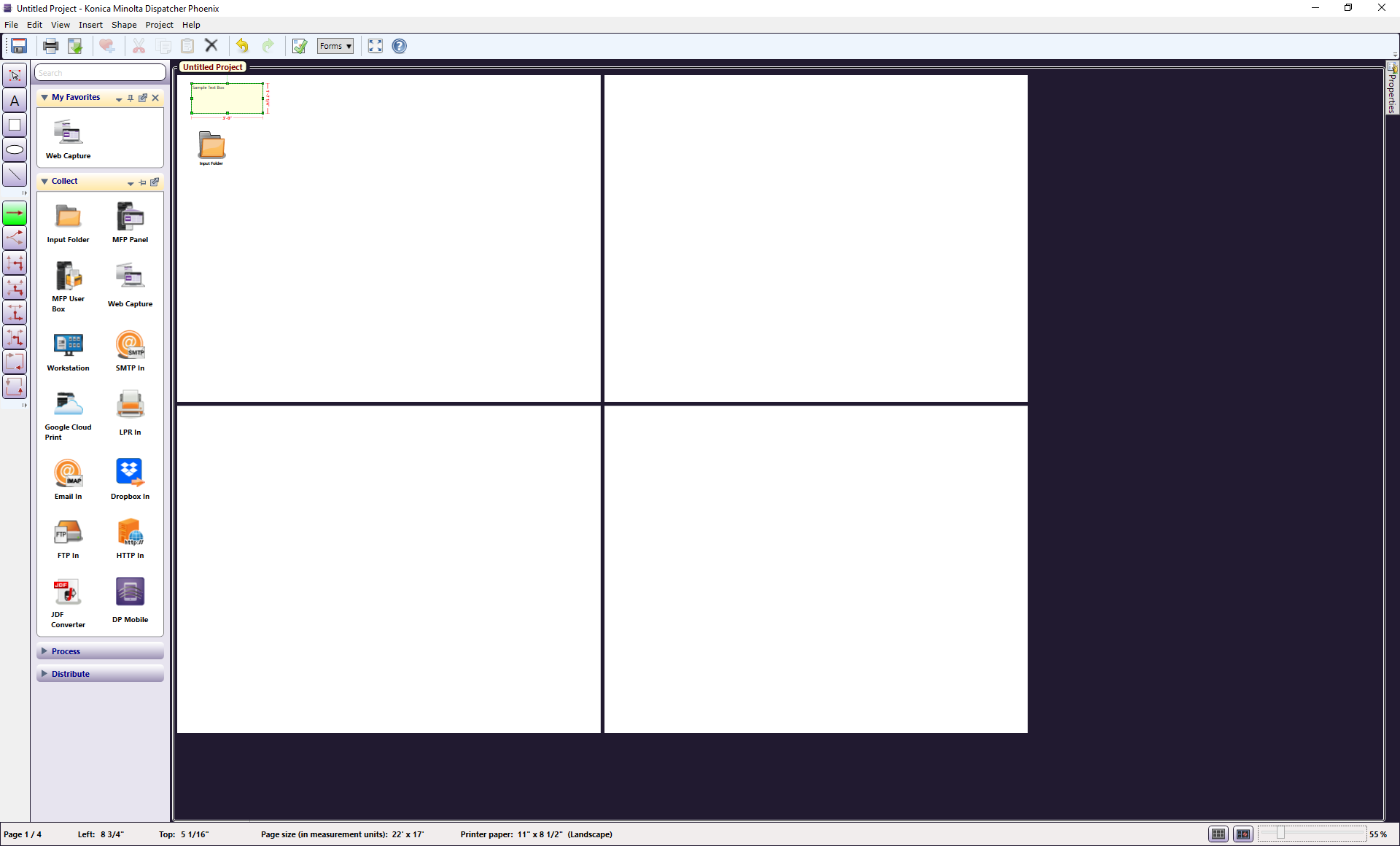
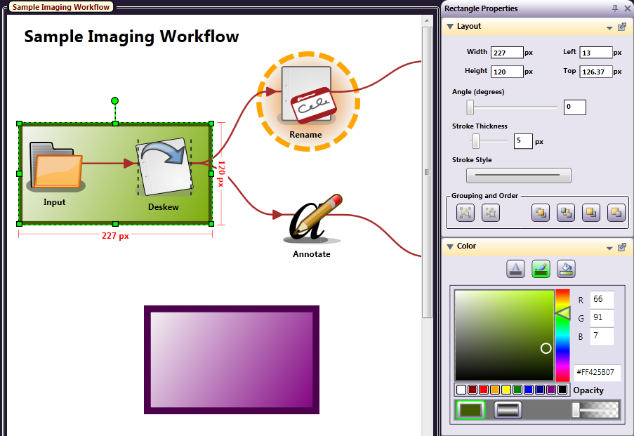
The following illustration points out more of the features of the Workflow Builder. The part of the screen where you drag-and-drop your objects is called the canvas, or canvas work area. On the left side of the screen are Drawing Tools and Connectors, Nodes Palettes, and, at the top of the window, Menus and Menu Icons.
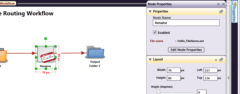
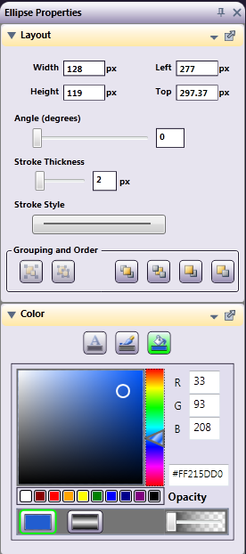
Properties Panel (Visual Attributes)
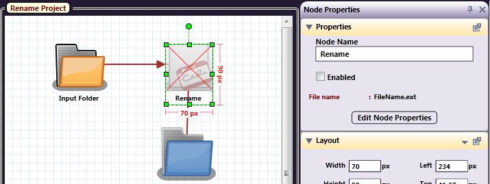
When the Properties panel is opened, it will only show the Properties specific to the object you have selected. The Properties panel allows you to define the visual traits of an object, such as size, color, font, and order. You can also disable nodes by unchecking the Enabled box.
Note: Double-clicking on a node opens its window only; it does not open the Properties panel for the node. To change the node definition, but not its visual properties, double-click on the node.
To open the Properties panel, do one of the following:
-
Highlight an object and either mouse-over or single-click on the small Properties tab to open it.
-
Select an object and either right-click (for a context menu), or select Properties from the Edit pull-down menu (Edit > Properties).
-
Select an object and press <F4>.
Work Area Properties
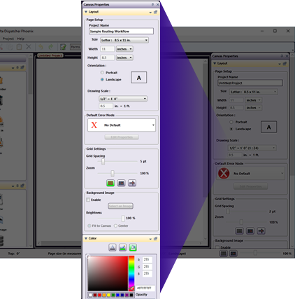
The Workflow Builder work area’s properties include Page Setup, Default Error Node, Grid Settings, and Background Image under Layout and additional attributes under Color.
-
Under Page Setup, the paper size drop-down menu has most of the commonly-used sizes, but you can use the Width and Height options to create a custom size. For page Orientation, mark the appropriate button.
-
To specify a Default Error Node, choose the appropriate node from the drop-down list in the Default Error Node area. Then select the Edit Properties button.
-
For Grid Settings, use the Grid Spacing slider to determine how far apart the grid lines are, and the Zoom slider to determine the view.
Note: The three buttons in this section toggle the Grid, Snap to Grid, and Cross-hairs on/off.
-
Right-clicking inside the properties panel sections allows you to Set Layout or Color Defaults. You can also set the defaults using the small menu icon (the little triangle).
If you set any properties as default, they will be used the next time you create or edit a workflow object for which the defaults are set.
The following illustration explains how to keep the Properties panel open, “pinned,” or on Auto-Hide. The icon of an arrow coming out of a box allows the sections of the panel to “float” anywhere you want on the screen.
Default Error Nodes
Instead of drawing an error output node for every node in your workflow, you can define a default error node that will handle all error transitions. In this case, all failed documents will be forced into this default error node, which will not be visible from your workflow. You can specify any distribution node to act as the default error node, such as:
-
An output folder
-
An MFP device
-
An SMTP server
-
An FTP server
If you do not want to specify a default error node, make sure the No Default option is selected from the Default Error Node pull-down list (this is the default).
Workflow Button Icon
The Workflow Designer allows you to select an image to use as the workflow preview image at the MFP. You have the following options:
-
Enable - Clicking in this checkbox allows the workflow to display using a custom image. By default, the workflow displays the first page of the workflow.
-
Select an Image - This allows you to choose browse for an image from your computer or your clipboard.
To select an image, do the following:
-
Select the Select an Image button. This will open the Select an Image window.
-
Browse for an image.
-
You will be provided the opportunity to crop the image to your desired size.
Notes:
- On the MFP, the workflow image displays workflow images at 250x250px. This can result in stretching, if the image is not cropped to a similar size.
- By default, Memory Optimization is enabled, which can aid in loading times at the MFP.
-
Click the Select button to save your choice and close the window.
After selecting an image, a small version of the image will display in this area.
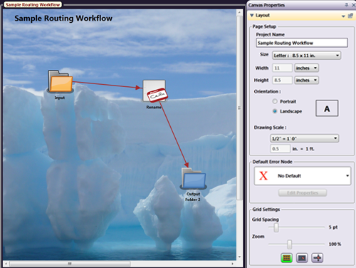
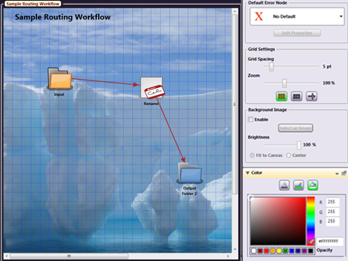
Background Image
You can also choose to upload a picture to use as your background. In the following illustration, a photograph is used; however, you could use a floor plan, map, or any other image. To specify a background image, do the following:
-
Double-click on the canvas work area or open the Properties panel without any objects selected.
-
In the Background Image area, check the Enable box; then select the Select an Image button to specify the image that you want (with file types: PNG, JPG, GIF or BMP).
-
Select the OK button to upload it.
-
Use the Brightness slider bar to change the brightness of the image.
-
Define whether the picture should be fit to the canvas or centered on the canvas using the appropriate radio buttons (Fit to Canvas and Center).
Note: If the image is large, it will shrink to fit on the canvas, even with Center selected. If the uploaded image is small, such as an icon-sized image (45 x 45 pixels), choosing Fit to Canvas may distort the image as it is made larger to fit.
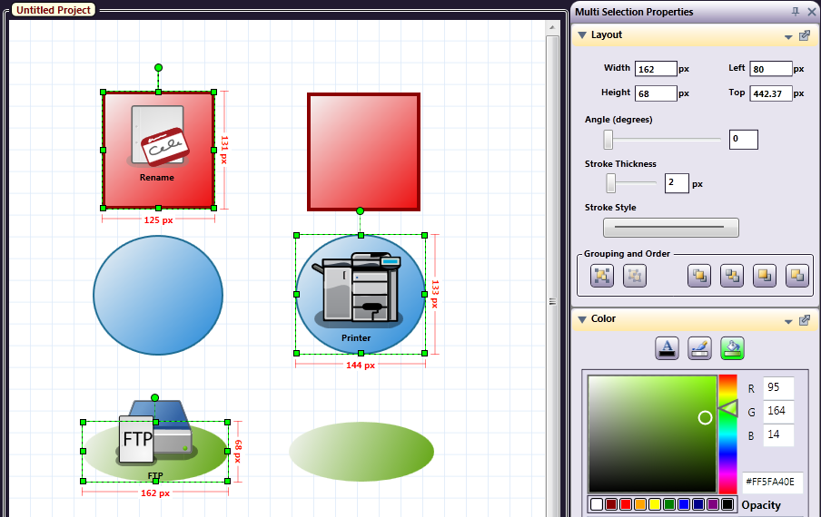
Layout
On the Layout section of the Properties panel, you can do the following:
-
Adjust the Width and Height of an object using the Width and Height fields.
-
Specify the object’s distance from the left or top of the drawing using the Left and Top fields.
-
Specify an angle for the object’s placement on the canvas using the Angle slider.
-
Modify the thickness of the object’s stroke using either the Stroke Thickness slider or specifying a value in pixels in the field next to the slider. You can change multiple objects, of the same type, at the same time.
-
Specify the object’s border line style using the Stroke Style box (solid, dashed, or dot and dash combinations).
-
Specify the grouping and order of the object using the icons under Grouping and Order.
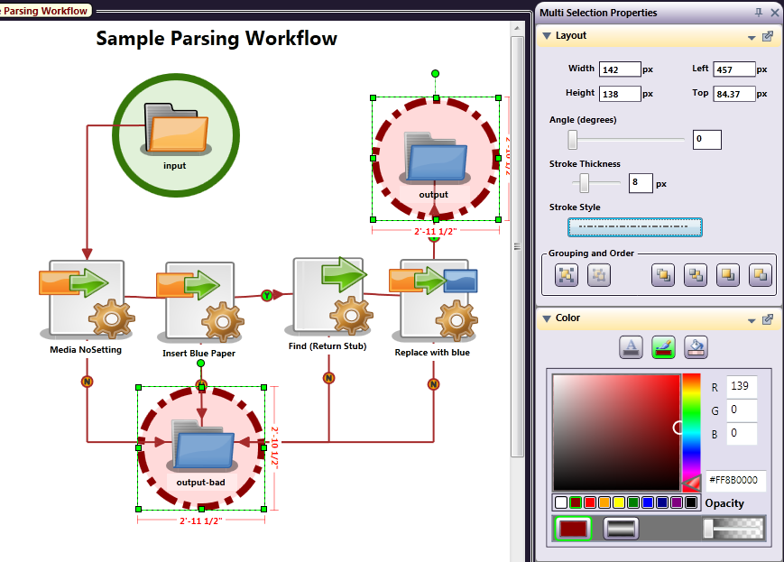
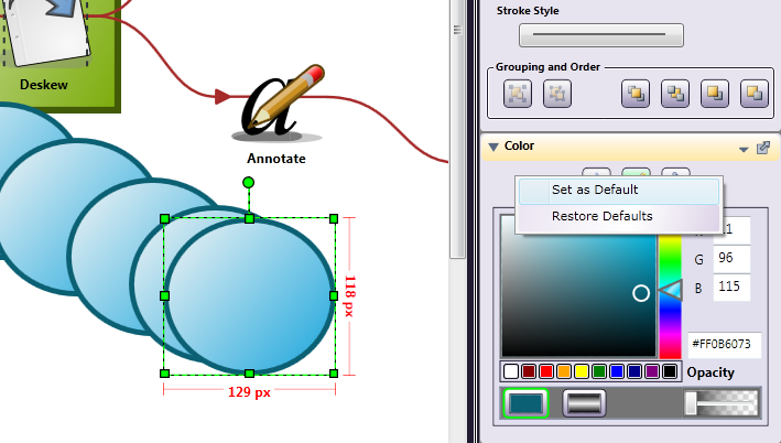
The illustration below shows two circles selected and their stroke style and thickness changed. If multiple nodes were selected, you could even change their icons simultaneously!
Default Settings
The changes you make to the page layout, error node, grid and background image can be set as the default configuration. This way, each time you open the application, your preferences will already be set.
Set Defaults
To set your preferences as default settings, right-click anywhere on the Properties panel; choose Set as Default from the context menu. Then, select either Page Settings, Error Node, Grid Settings or Background Image Settings. Once selected, any settings made for that section will be saved as the default configuration and will appear each time you create a new workflow.
Restore Defaults
If you make changes to the layout, grid or background settings but wish to return to your default configuration, you can restore these settings. To restore your preferences to the default settings, right-click anywhere on the Properties panel; choose Restore Default from the context menu. Then, select either Page Settings, Error Node, Grid Settings or Background Image Settings. Once selected, any settings made for that section will be reverted to the default configuration.
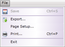
File Menu
The File menu in the Workflow Builder includes Save, Export, Page Setup, Print and Exit.
-
Select Save to put the workflow in a proprietary location.
-
Select Export… to export your workflow file as a XPS, PDF, or PNG file type in the location of your choice. The Export window will open, as in the following illustration:
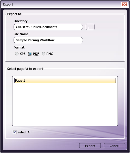
On the Export window, do the following:
-
In the File Name field, enter a File Name for your exported file.
-
Choose the Format you want using the appropriate radio buttons (XPS, PDF, PNG).
-
Select the Export button to save the exported file.
-
-
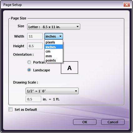
Select Page Setup… to edit or set defaults for the workflow page. (See the following illustration).
-
Choose Paper Size, and measurement units: Inches, Pixels, Centimeters, Millimeters, or Points.
-
If Inches is selected, set the desired Drawing Scale.
-
Check the Set as Default box to save the Page Setup options.
-
Select Print… to print the workflow.
-
Select Exit to close the application.
-
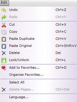
Edit Menu
The Edit menu includes many editing functions that are typical of Windows applications, including: Undo, Redo, Cut, Copy, Paste, Delete, and Select All,** and do exactly as expected to a selected object. These functions are also available via the context menu by right-clicking on an object. Other options on the Edit menu are:
-
Select Undo to reverse the last action you performed. If, for example, you deleted a node by accident and need to get it back, you could use Undo.
-
Select Redo (not enabled until you use the Undo function) to repeat the action that had been previously “undone.”
Undo and Redo can be used on the following actions:
-
Adding or deleting workflow elements (nodes, connectors, drawing objects)
-
Moving or resizing a workflow object
-
Cutting, copying and pasting workflow elements
-
Changing properties (color, font size, stroke)
-
-
Select Cut to remove the selected element.
-
Select Copy to copy the element to the clipboard.
-
Select Paste Duplicate (only available if you copy a Node such as the Input or Output folder) to create an independent copy of the node with the same properties as the originally copied node. If you make changes to the duplicate copy, those changes will not affect the original, copied node.
-
Select Paste Original (only available if you copy a Node such as the Input or Output folder) to create a pasted version of the same node. If changes are made to the pasted node, they will also be applied to the original node. In the following illustration, the Input Folder node was copied to the clipboard and has the following context menu options:
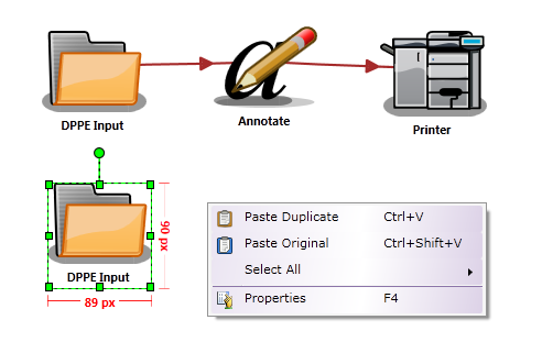
If you are copying any other element, such as rectangles, text boxes, circles, etc., or copying a mixture of nodes and objects, only the “Paste Duplicate” option will be available.
- Select Lock/Unlock to lock an object(s) to the canvas. When an object has been locked, a small lock icon will become visible in the upper left corner of the object when the node is highlighted. This is positional only for use with nodes and drawing objects; it has no effect on the attributes of the node.
Warning: Even if a node is locked, it can still be deleted! The “locking” is only positional with regard to the work area.
-
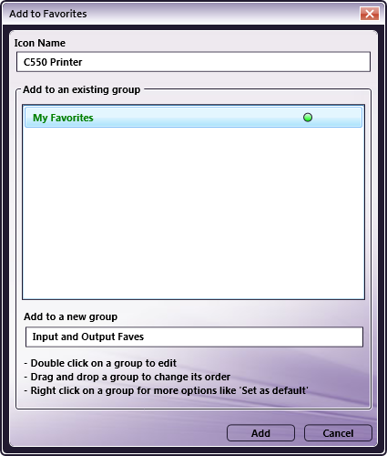
Select Add to Favorites to create your own custom nodes palettes for use with your workflows. To add a defined node to a “favorites” group, select the node; then do one of the following:
-
Select Add to Favorites… from the Edit menu. Or,
-
Right-click on the node and then select Add to Favorites from the context menu that appears. Or,
-
Click on the heart icon above an existing node (in a node palette).
Note: You can also save Grouped nodes as a Favorite.
The first time you add a favorite, you need to either add it to the default My Favorites group, or specify a new group to add it to, as in the following illustration:
To remove a node from a Favorites group, click on the heart x icon in the upper left corner of a node in the group.
-
-
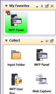
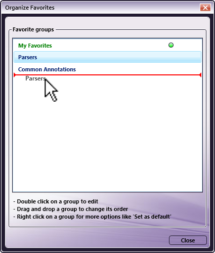
To organize the nodes palettes if you have created more favorites groups, select Organize Favorites…. In the Organize Favorites window, you can do the following:
- Drag the palettes in the order that you prefer, as in the following illustration:
-
Specify a default Favorites Group. Right-click on the group title; then choose Set as Default from the context menu.
-
Rename a default Favorites Group. Right-click on the group title; then choose Rename from the context menu.
-
Delete a default Favorites Group. Right-click on the group title; then choose Delete from the context menu.
-
To select all similar shapes or all shapes at the same time, select Select All or press Ctrl + A.
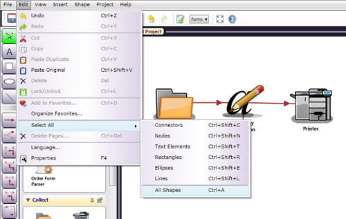
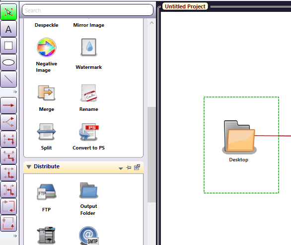
You can drag around the objects to be selected using the Select/Resize tool. To do this, choose the Select/Resize tool, click on the canvas above the objects, then hold down the mouse button and drag the mouse pointer around the multiple objects. Once selected, they can all be cut, copied, pasted, deleted or moved as a group. See the following illustration:
Language Manager
Note: Before you can use the Language Manager, you must have Konica Minolta’s LocoLingo 3.0 application installed. This is provided for free on the SEC Website (http://sec.kmbs.us).
To open the Language Manager with LocoLingo installed, launch Dispatcher Phoenix and do one of the following:
-
On the main screen, select Language… from the Tools pull-down menu.
-
In the Workflow Builder, select Language… from the Edit pull-down menu.
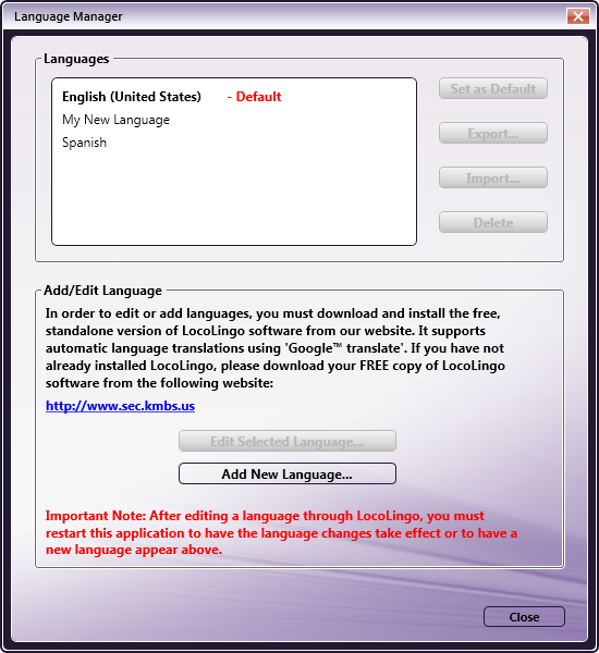
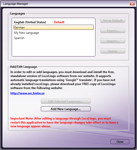
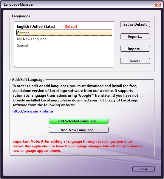
The Language Manager’s first screen lists any existing languages (English is the default) and allows you to Edit or Add New Languages. The initial screen, as in the following illustration, displays the Edit Selected Language… button grayed-out because you haven’t yet selected a language for editing:
Adding a New Language
To create a new language, select the Add New Language button on the Language Manager screen. The Create New Language window will open, as in the following illustration:
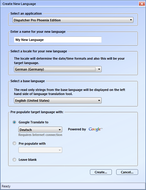
On this window, do the following:
-
In the Enter a name for your new language field, type in an appropriate name for the new language.
-
In the Select a locale for your new language drop-down box, select a geographical location. Locations are listed in both English and the actual language. You can only use one location per language, so you cannot create a new language using “English (United States),” because it is already used for the default language.
-
In the Select a base language drop-down box, select the base language with which to list the words and phrases to be translated. The base language that you choose will be used to list the words and phrases in the left column of the editing screen.
-
To pre-populate the translations using the Google Translate tool, select the Google Translate to radio button; then select the appropriate language in the drop-down box. The words and phrases will be translated for you, and a progress bar will display at the bottom of the screen. Note that some words or phrases, such as user-entered node names or technical phrases (ex: pixel or SMTP) will not be translated via this method; however, you can edit these phrases manually in the Language Manager.
-
To pre-populate the translations with language already available in the application, select the Pre populate with radio button; then choose the appropriate language in the drop-down box. If you choose this option, the window will open for you to enter the translations.
-
To enter all of your own translations, select the Leave blank radio button.
-
Select the Create… button when you are done.
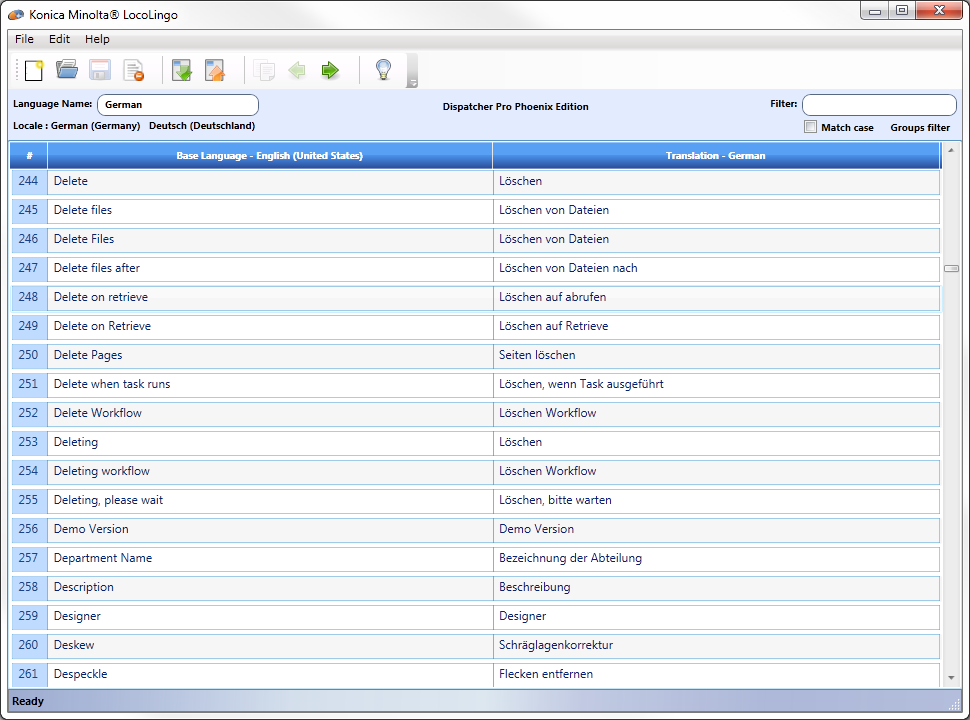
Once translated, the Language Translation window will open with the base language on the left and the translations on the right side of the page, as in the following illustration:
If you choose to pre-populate the translation fields, the window will open for you to enter the translations.
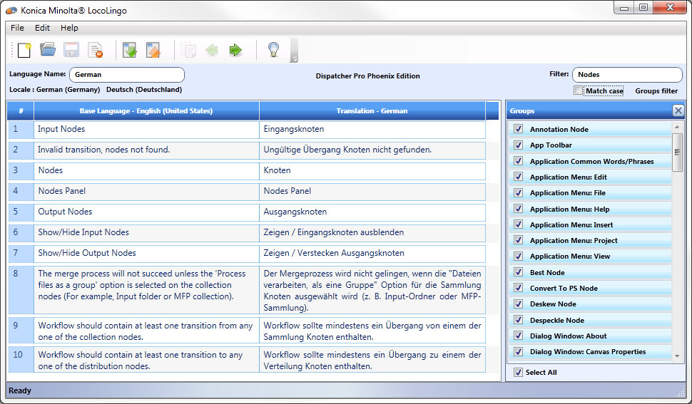
Filtering
Since there are so many words/phrases to translate, there are various filters you can use to narrow down the list.
-
To narrow the list by group, click on the Groups filter button to select which phrases to show based on application function.
-
To limit the words/phrases to a specific text string, use the Filter field. It will filter by the word(s) as you type. You can also specify whether or not to match the word/phrases by case by selecting the Match case checkbox.
In the illustration below, only words and phrases in the application that contain the word “Nodes” are displayed:
Applying Language Changes
To have the language changes take effect, close the Language Translation window and exit the Dispatcher Phoenix application completely.
If you were in the Workflow Builder, you must exit both the Workflow Builder and Dispatcher Phoenix in order for the changes to be put into effect.
In the following illustration, the new language has been added:
The Language Manager includes an automatic spell check function which uses the dictionaries from Microsoft Word. If you have MS Word installed on your PC, the Spell Checker will be automatically enabled for the following languages: English, French, German, and Spanish.
Editing an Existing Language
-
To edit an existing language, select Language… from the Edit drop-down menu in the main application screen.
-
On the Language Manager window, choose the language that you want to edit; then select the Edit Selected Language… button, as in the following illustration:
The Language Translation window will appear, with the words and phrases on the left and translated words and phrases on the right. If you select a word or phrase on the left, the same entry is selected on the right.
-
To enter or change the translation word/phrase that you want to use, type over the word on the right.
-
After you have edited at least one phrase, save your changes by clicking the Save icon (
 ), as in the following illustration:
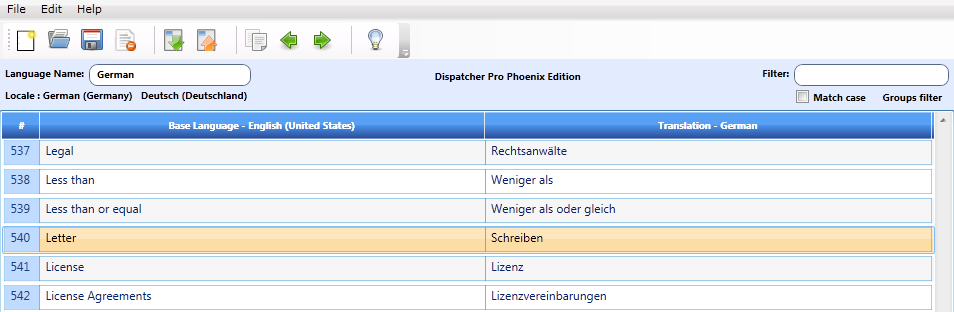
To have your changes take effect, restart the Dispatcher Phoenix application.
Important! After editing a language through LocoLingo, you must restart this application to have the language changes take effect or to have a new language appear in the list shown above.
Exporting/Importing Language
The Language Manager allows you to import or export a language. Exporting a language file allows you to navigate to, and open the language file in an Excel spreadsheet, or as a LocoLingo file, so you can perform the translations at your own pace.
-
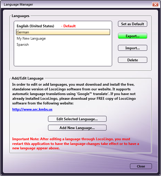
To export a language from the Language Manager window, choose a language and select the Export… button, as in the following illustration:
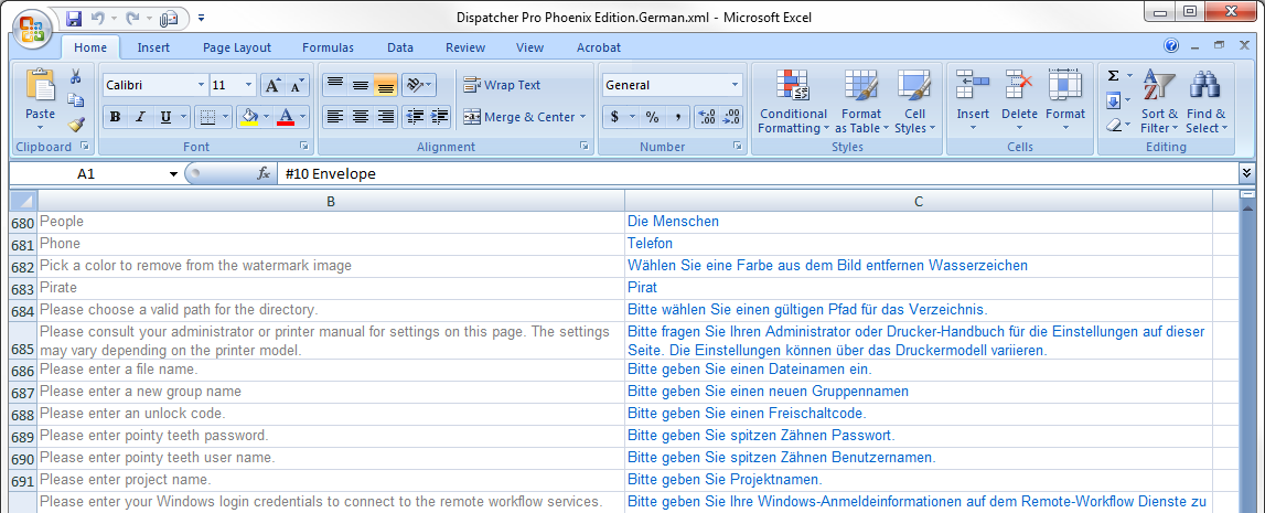
A message will display if your language file has been exported successfully. The following illustration shows an example of a language file successfully exported to, and opened in, an Excel spreadsheet:
-
When you finish translating all of the words and phrases in your exported file, open your application, and go to the Language Manager. Choose the language to be overwritten, and select the Import… button. The Import As… window will appear, as in the following illustration:
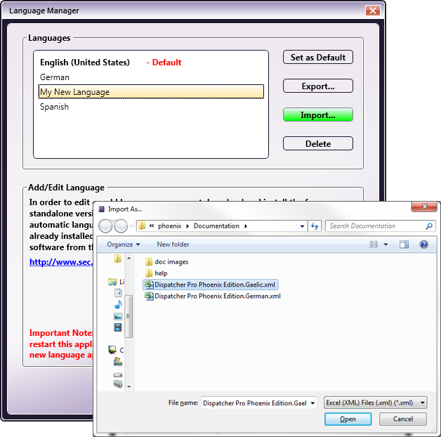
-
On the Import As… window, choose the replacement language file; then select the Open button.
If it is desired to keep the current default language intact after importing an additional language, it will be necessary to create a new language to serve as the base language for the import.
Follow the steps detailed above to add a new language. The Leave Blank option may be selected to save time, since this language will be overwritten upon import. As described above, highlight the new language and click Import to select the new language file.
Once imported, this new language can be set as the default while leaving the original default language intact. Restart the application for the new language to take effect.
Note: If you import an incomplete translation file, the application will show asterisks for words and phrases that have not yet been translated.
As shown in the example above, select the language file to be imported, and select the Open button. A message will display if the file has been successfully imported.
You can also Import a language file completed by someone else, if it is for the same application.
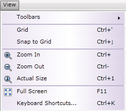
View Menu
-
Select Toolbars to display or hide toolbars (the icons at the top of the canvas area), drawing tools, node panel, properties panel, and status bar.
Hiding toolbars will give you more room to draw (the Insert menu can be used to create the drawing objects without using the drawing tool box). In the following illustration, no toolbars are displayed:
-
Select Grid to display or hide the grid. This function can also be performed using the Grid icon at the bottom of the screen (
 ).
). -
Select Snap to Grid to pull objects to the nearest grid line or not. This function can also be performed using the Snap to Grid icon at the bottom of the screen (
 ).
). -
Select Zoom In to magnify the view of the canvas (bring you closer to the canvas).
-
Select Zoom Out to reduce the view of the canvas (take you farther from the canvas).
-
Select Full Screen to have the Workflow Builder screen take up your entire monitor. Press F11 or the Esc key to return to the previous view.
-
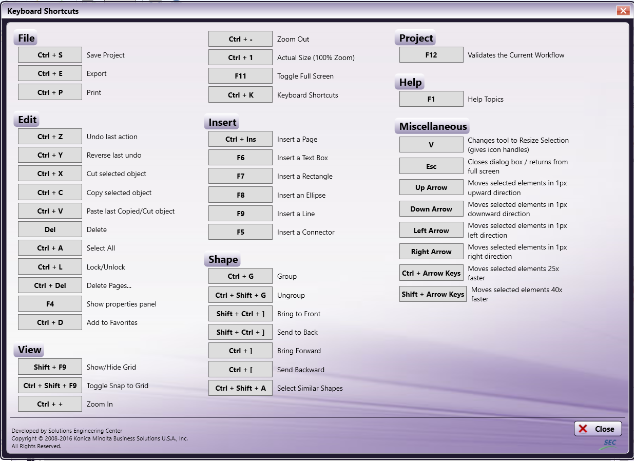
Select Keyboard Shortcuts… to open a window that lists the available keyboard shortcuts, as in the following illustration:
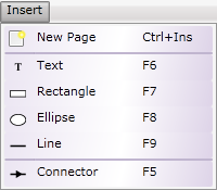
Insert Menu
The Insert menu enables you to add a new page or a drawing object. You can use this menu at any time, but it is especially helpful when you are working in the application with the Toolbars hidden.
-
Select New Page to add a new page to a Workflow Builder workflow project.
-
Select Text to add a note, title, or any text in the canvas workflow area, as in the following illustration:
-
Select Rectangle to draw a rectangle or square around nodes (to visually group them). Rectangles and nodes can even be rotated using the small circle above the object.
-
Select Ellipse to draw an oval or circle around nodes.
-
Select Line to draw a line of the canvas.
-
Select Connector to connect two nodes. Like a drawing object, the connectors can be different colors; however, unlike a drawing object, connectors can have more details assigned to them. Use the Layout section to show or hide symbols (arrows), to indicate an error, or even a Yes or No decision.
Notes:
-
With the exception of Lines and Connectors, all drawing objects and icons work with snap-to-grid function to help you line up the objects in your workflow.
-
All rectangles, ellipses, lines and text boxes can take advantage of the line styles, stroke thickness, opacity and colors under Properties.
Insert Multiple Pages
If your workflow turns out to be larger than you thought, use the Insert menu to add pages. To add a page, or pages, to an existing workflow, select New Page from the Insert pull-down menu.
Note: You may have to change the “zoom” percentage to view the added page(s). In the following illustration, the page was “zoomed” out to 55%:
Connecting Elements Over Multiple Pages
Multiple elements of a workflow can be copied and pasted from page to page. When you copy a node, special paste options become available: Paste Original and Paste Duplicate. Copying a node on one page and using Paste Original to paste it on another page is the equivalent of using a connector between two nodes on the same page.
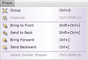
Shape Menu
The Shape menu allows you to arrange the shapes drawn on the canvas.
-
Select Group to group one or more shapes together.
-
Select Ungroup to ungroup the grouped shapes.
-
Select Bring to Front to place object(s) in front of other objects.
-
Select Send to Back to place object(s) behind other objects.
-
Select Bring Forward to place an object in front of other objects one level.
-
Select Send Backward to place an object behind other objects one level.
-
To select similar shapes (ex: all rectangles or all circles), select one of the shapes on the canvas work area; then select Select Similar Shapes. This allows you to make the same changes to all of the shapes at once.
These menu options are also available in the Properties panel in the Layout section.
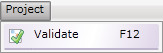
Project Menu
Select Validate to check that your workflow is logical and has followed all the rules of the application.
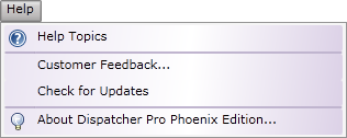
Help Menu
-
Select Help Topics to access online help.
-
Select Customer Feedback… to send us comments about the application or if you have experienced an error. The Konica Minolta Quality Feedback Agent window will appear.
-
Select Check for Updates to check whether or not there are updates available.
-
Select About Dispatcher Phoenix… to view information about your copy of the application.
Drawing Tools
The Tools and Connectors for drawing your workflow are described in this and subsequent sections.
Tools
-
 Select/Resize. Use this tool to select objects on the canvas, and resize them by dragging the Handles to the desired size.
 -
 Text Box.
Inserts text on the canvas screen which you can use to add details to the flow.
Text Box.
Inserts text on the canvas screen which you can use to add details to the flow. -
 Rectangle.
Draws a rectangle (or square) shape on the canvas work area.
Rectangle.
Draws a rectangle (or square) shape on the canvas work area. -
 Circles/Ellipses.
Allows you to add circles or ovals to your drawing.
Circles/Ellipses.
Allows you to add circles or ovals to your drawing. -
 Line.
Adds lines, of many styles and sizes, to the drawing.
Line.
Adds lines, of many styles and sizes, to the drawing.
Connectors
-
 Single. Connects objects with a straight line.
 -
 Bezier Curve.
Connects with a curved line.
Bezier Curve.
Connects with a curved line. -
 Right Left - Up Down.
Connector goes right or left then up or down with a right angle.
Right Left - Up Down.
Connector goes right or left then up or down with a right angle. -
 Up Down - Right Left.
Connector goes up or down and then right or left with a right angle.
Up Down - Right Left.
Connector goes up or down and then right or left with a right angle. -
 Down Up - 90 degrees - Left Right.
Goes down/up, left/right with another 90 degree angle.
Down Up - 90 degrees - Left Right.
Goes down/up, left/right with another 90 degree angle. -
 Left Right - 90 degrees - Down Up.
Goes left/right, up/down with another 90 degree angle.
Left Right - 90 degrees - Down Up.
Goes left/right, up/down with another 90 degree angle. -
 Right Angles Connect Sides.
Right angle lines connect to the Sides of the objects.
Right Angles Connect Sides.
Right angle lines connect to the Sides of the objects. -
 Right angles connect Top or Bottom
Right angled line connects to the top or bottom.
Right angles connect Top or Bottom
Right angled line connects to the top or bottom.
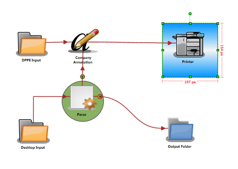
An example using several drawing tools follows:
Select and Resize
The Select/Resize tool is an arrow (with handles at each corner) used to select, resize, or move objects in the canvas work area. Click on the Select/Resize tool, click on a node to highlight it, and move it or drag the handles to make it larger or smaller.
Note: The Resize option, if used on a Group, resizes all of the objects in the group simultaneously. Font size is changed in the Text section of the Properties panel.
Multiple Select
There is more than one way to select multiple objects on the canvas:
-
Click on the first object, hold down the <Ctrl> key, and click on the other objects to be selected, or
-
Use the Select/Resize tool to click and drag around several objects at one time, selecting all of them, including the connectors, as show in the following illustration:
Hint: You can use the Edit > Select All, or the Shape menu, to select similar objects. Use <Ctrl> + A to select ALL objects on the canvas.
Text Box Drawing Tool
Workflows can have text boxes added to help explain the different details of the flow. Do the following:
-
Click on the Text tool, click on the canvas, and then drag the mouse to draw a text box. Do not worry too much about the size of the text box, as you can adjust it later.
-
Double-click on the text box and type the words you want included with the drawing. The text will wrap to the width of the box drawn.
On the Properties panel, you can do the following:
-
Use the Text section of the Properties panel to adjust the text to the size and style you want. You can change the size, make the text Bold or Italic, and set the alignment.
-
Use the Layout section to change the stroke thickness and style.
-
Use the different buttons to change the justification of the text.
-
Use the Grouping and Order section to put the text box in the Front or Back.
-
Use the Color section to change the text foreground, text background and text border.
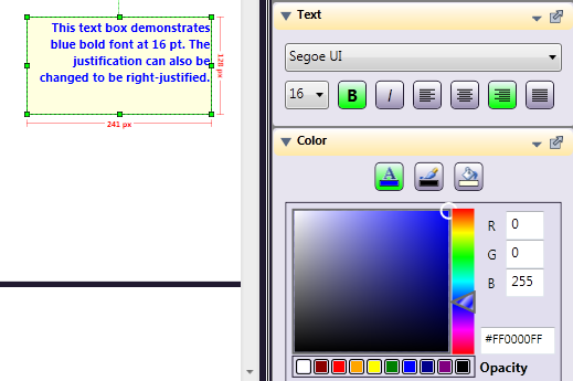
In the following illustration, the text box has been changed to Bold, 16 pt, with right alignment:
To delete a text box or any object on the workflow, highlight the text box; then click on the Delete icon (
 ) on the menu bar, use the Delete key, or right-click and use the Delete option on the context menu.
The default font for a Text Box is the Windows default for your PC, but you can change this, by way of a drop-down list of fonts, as in the following illustration:
Note: An in-line spell check feature is included. If a word in either a text box or node label is misspelled, it will be underlined in red. Right-click on the word for a list of possible replacement words to correct the spelling.
-
Rectangles and Circles
Circles and rectangles can visually associate multiple nodes, and colors can be used to represent areas of responsibility.
Follow the steps below to draw some objects using the tools on the left side of the screen.
-
Click on the Rectangle or Ellipse drawing tool to select it; then click and drag to draw an object. With the object selected, click on the Properties panel (or press <F4>), go to the Color section and click on the “Fill Color” indicator.
-
Within the Color section, click on the arrow slider and move it upward until the color indicator is in the desired range. Click inside the color indicator box and use the mouse pointer to move the color “picker” around until you find a shade that you like, and then let go of the mouse button.
-
Use the Layout section to change the Stroke Thickness and Style for the Border of a drawing object. The stroke, or object border, can be solid, dashed, or dashed and dotted. You can also right-click or use the small menu to set Layout defaults.
-
Use the Grouping and Order section to Bring objects to the Front, Send them to the Back, or somewhere in-between. Group objects for resizing, or just to have them stay together.
Note: Although nodes can be grouped, the connectors will not be part of that grouping.
Set Color Defaults
You can set color defaults for objects drawn on the canvas, and for the canvas area background and grid lines. To define colors for a rectangle, for example, highlight a rectangle, make its background and border the color you want, then right-click in the color section and choose Set as Default.
Note: Another way to set the default is to click on the small triangle in the section header to access the menu.
Lines and Arrows
Line Properties, besides Stroke Thickness and Style, also include Color and Opacity. The thickness of the stroke can be changed using either the slider bar or by entering a numerical width, in pixels. Different styles of dotted lines can also be selected from a drop-down in the Layout section of the Properties panel. Arrows can be added to lines, at either end, at both ends, or in the center. Lines can also be assigned a specific angle using the slider or by changing the degrees.
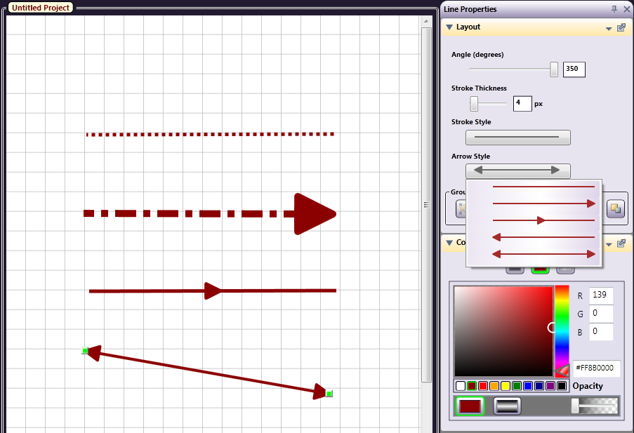
Note: Line angles cannot be set if changing the degree of angle would put the line off the canvas (i.e., the line is too close to the edge).
Rotate Shapes
Nodes and other objects drawn on the canvas can be rotated, using the mouse to move the circle above the center of the selected object, as in the following illustration:
Connectors
Connectors are more than lines with arrows because they actually connect the nodes. After creating nodes, click on the desired connector, click on the originating node, and drag the connector to the next node, creating a transition between them.
The Connector types are as follows:
-
Straight Connector
-
Bezier Curve
-
Horizontal bend to Vertical
-
Vertical bend to Horizontal
-
Horizontal with additional 90 degree angle, continuing in a Horizontal direction
-
Vertical with additional 90 degree angle, continuing in a Vertical direction
-
Angled connector which snaps to the Sides of objects
-
Angled connector which snaps to the Top or Bottom of an object
Although Connectors represent transitions from one node to another, they are visually like other drawing tools, in that they can be of different colors, opacity and gradient. Use the slider bar to find the Color “family” you want, and then the color picker to determine the exact shade. You may also choose one of the commonly used colors shown underneath the color picker area.
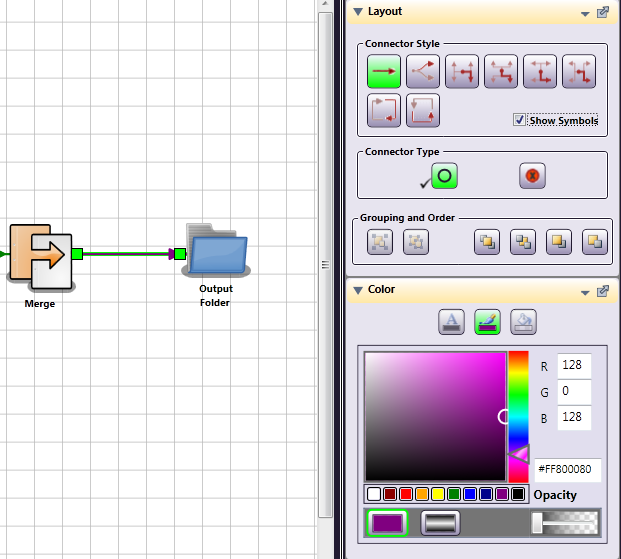
Connectors can be different colors, if you so choose. Besides the Connector Style, you can uncheck the Show Symbols box if you’d like to hide the connector’s directional arrows. You can also drag the point of a connector to a different node, without deleting and redrawing it.
Note: Moving connected nodes very close together, even if those nodes are not touching, will result in the connector line not being visible.
Connector Definition
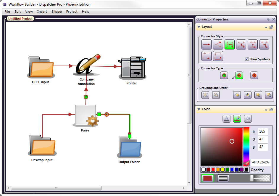
Connectors of any type can have an Error path, and a connector in a Parse workflow can indicate Yes, No decisions, or an Error. You change the Connector Type under Layout, by selecting the connector and then the Type.
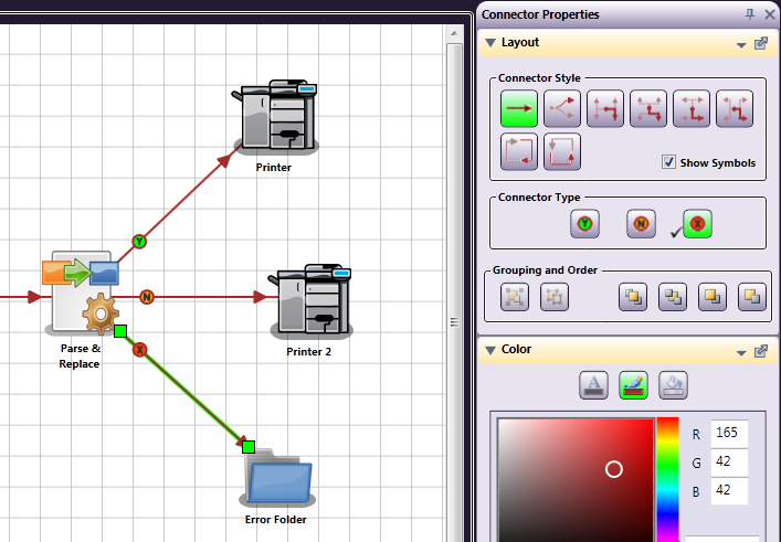
Within a Parser node, the Connector Type can be determined by a True/False condition. For example, if a Parser Node contains a search for a specific phrase, but the phrase is not found, the workflow can be made to take a different path, transitioning to a different Distribution Point than it would if the phrase had been found.
When a process fails, causing an error, the file is either passed to the connector that has the error connector type enabled and connected to the designated error location (typically, an Output folder), or the Default Error Node (if it is defined). If an error occurs and there is no connector with the error connector type enabled or defined Default Error Node, the file can be lost.
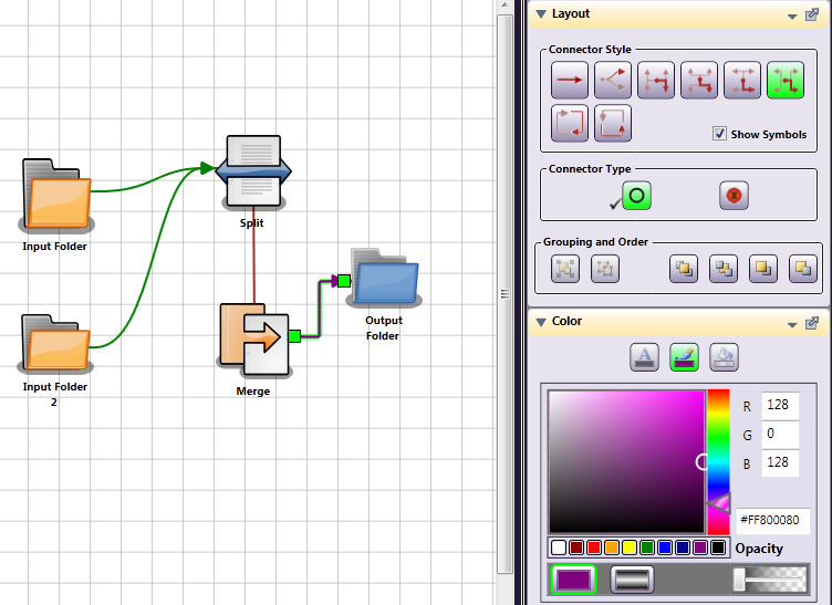
Multiple Connectors to the Same Output
When you are creating your workflow in the Workflow Builder, if you want your files to move to the next Node, regardless of the results of a Parser Rule, multiple Connectors can be drawn to the same Output Node. The connectors will be labeled Y, for Yes, then N, for No, and, if there is a third, X, for Error. You can manually label a Connector by selecting it and changing the Connector Type, under Layout. Please review the following illustration:
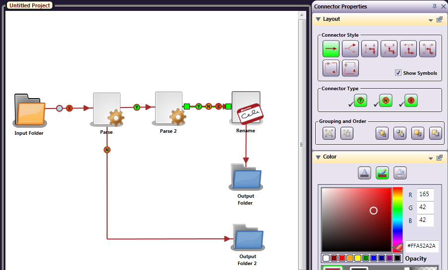
Multiple connections to the same Output Node, from a Regular Node (non-parser), can be labeled as Normal (a blank circle) or Error (red X in a circle). You can choose this Connector type manually, allow the Workflow Builder to label them in order, or de-select the Show Symbols check box so that no labels are shown. (Of course, if you hide the symbols, you won’t be able to tell that there are two transitions outbound!)
Node Palettes
All nodes are organized into palettes: Collect, Process, Distribute, and Favorites palettes (if defined). With all of these palettes, there are various sorting options available for you so that you can customize the Workflow Builder to best suit your needs. Any changes that you make will be saved for the next time the Workflow Builder is launched.
These options can be accessed by clicking on the down arrow on the palette’s title bar, as in the following illustration:
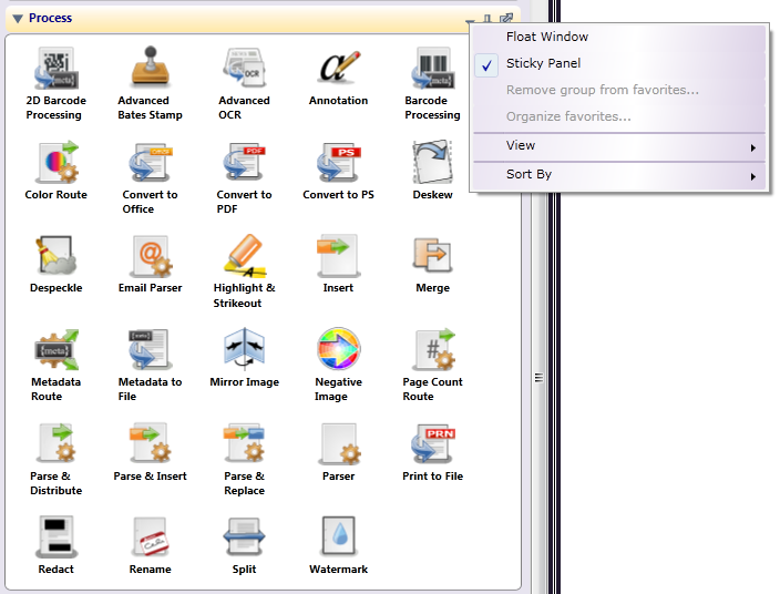
Using this menu, you can do the following:
-
Select Float Window to move the palette window anywhere around your Desktop.
-
Select Sticky Panel to keep the palette open.
-
Select Remove group from favorites…. to delete a Favorites grouping.
-
Select Organize favorites… to open the Organize Favorites window.
-
Select View to customize the appearance of the nodes within the palette.
-
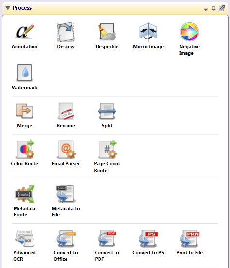
Select Sort By to customize the organization of the nodes within the palette. Options are:
-
By name (alphabetical), which is the default setting
-
By type, separated by a line
-
By type with no separating line.
For example, all routing nodes (Color Route, Page Count Route, and Email Parser) can be grouped together. Similarly, all parsing nodes (Insert, Parser, Parse & Distribute, Parse & Replace, and Parse & Insert) can be grouped together. The following illustration is an example of sorting a palette by type with a separating line:
-
Properties (Visual)
The visual aspects of nodes, shapes, and connectors are defined using the Properties panel. The Properties panel has up to four sections: Properties, Layout, Text, and Color, depending on what kind of object is selected.
Right-click on a node, shape, or connector and select Properties to open the panel. The Layout, Text, and Color sections of the panel (shown below) can be used to change the “look” of the nodes.
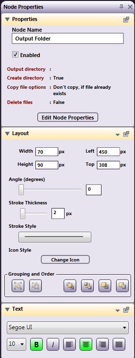
Node Properties
On the Properties section of the Properties panel, you can do the following:
-
Edit or create a name for the node on the Node Name field.
-
Enable or disable the node using the Enabled check box. When unchecked, the node will be ignored; documents will not be collected from, processed through, or distributed to this node location.
Note: If files are sent to a disabled output node, they will be lost.
A disabled node will be grayed-out with an X through it on the canvas, as in the following illustration:
Node Layout
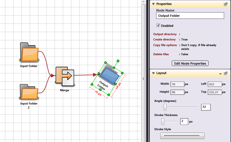
On the Layout section of the Properties panel, you can do the following:
-
Define the size and position of the object as it appears on the Workflow Builder using the Width, Height, Left, and Top fields.
-
Rotate the object on the Workflow Builder using the Angle sliding bar.
-
Choose a different image to represent the node.
-
Group and order the objects.
Change Icon
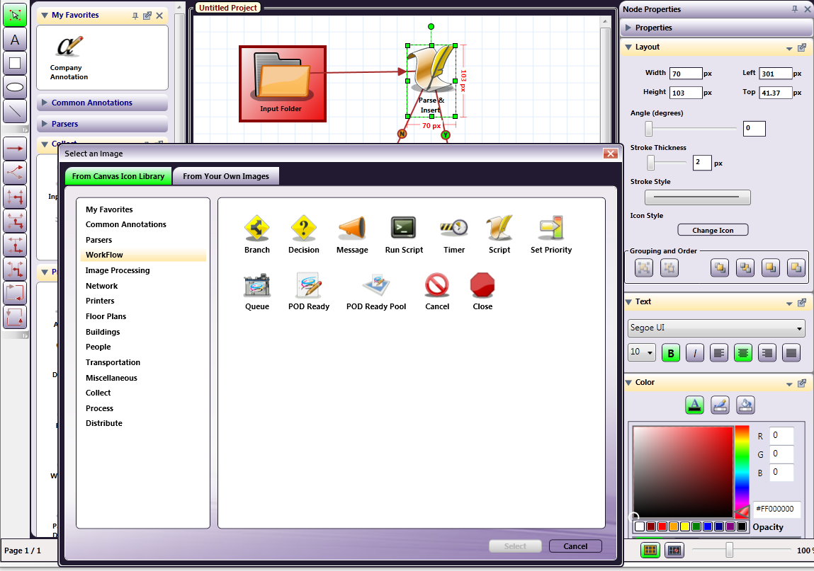
When a node is selected, the Icon style section under Layout has a Change Icon button, which allows you to choose an different image to represent the node. You can replace one or more nodes with any image file (BMP, JPEG, PNG, GIF).
-
To change an icon, select a node; then select the Change Icon button to find and upload the image of your choice.
-
On the Select an Image window, do one of the following:
-
Click on the From Canvas Icon Library tab to choose a different icon from the library, or
-
Click on the From Your Own Images tab to select an image from a file or the clipboard (assuming that you have copied an image to the clipboard previously).
-
Selecting From Canvas Icon Library
In the following illustration, a Parse & Insert Node was selected and changed to the graphical image of a Script node (from the Workflow library):
Selecting From Your Own Images
Once you have selected the From Your Own Images tab, you will be able to choose how to select your image (from a file or from the clipboard), as in the following illustration:
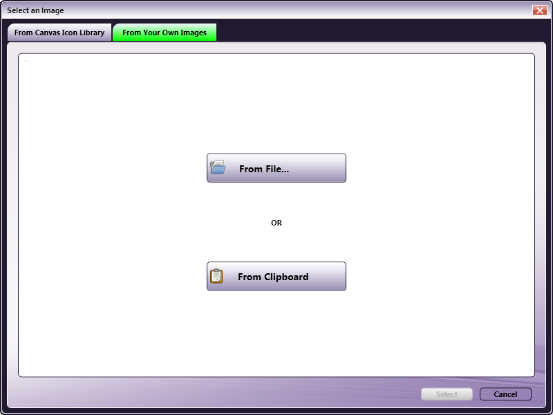
Do one of the following:
-
To select an icon from a file, select the From File… button. The Select an Image window will appear on which you can find and specify the file that you would like to use. You can choose the part of the image that you want. Click and drag the small box by its handles to do this, as in the following illustration:
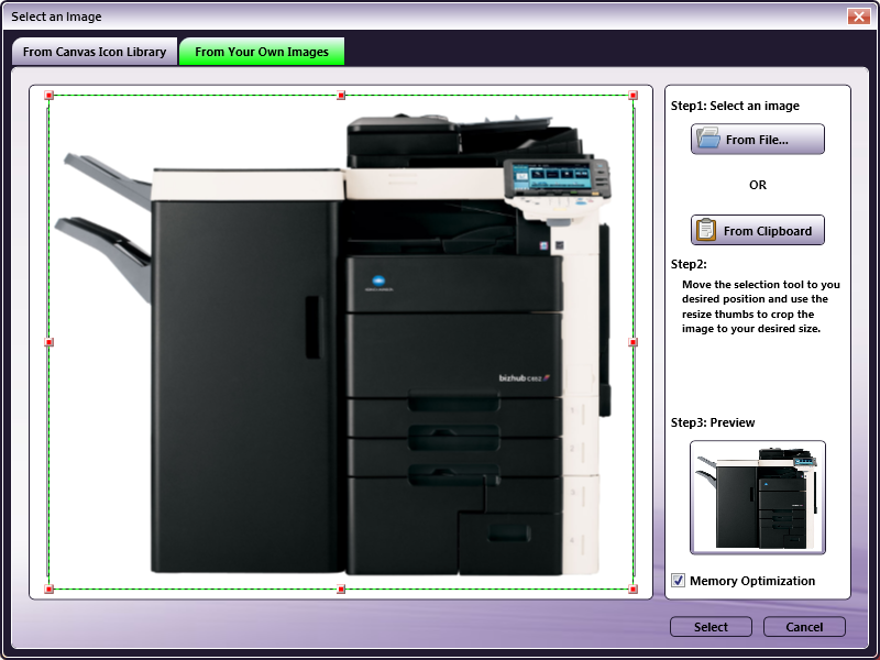
-
To select an icon from the clipboard, select the From Clipboard button. Instructions are included in the right pane. You can move and/or resize the square to determine which part of the copies image should be used; then select the Select button, as in the following illustration:
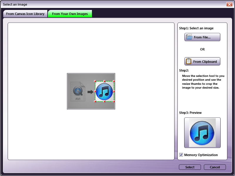
A preview of the image you select is shown on the right (see the illustration above). The Memory Optimization checkbox is automatically checked for formatting the image for your computer.
Caution! If you uncheck this box, the image will be enhanced, but it may increase memory usage enough to cause your system to slow down. To upload a picture with higher resolution, uncheck the box, but be aware that the better image will use more resources on your PC.
Note: In all the above mentioned cases, the image for the node is changed, but you have to change the label text yourself.
Grouping and Order
The Grouping and Order subsection allows you to arrange the nodes in the order you choose.
-
To send drawing objects behind the nodes, select the object; then click on the Send to Back icon, as in the following illustration:
-
To group multiple objects, select multiple objects and click on the Group icon (
 ). When objects are grouped, they can be resized or moved simultaneously.
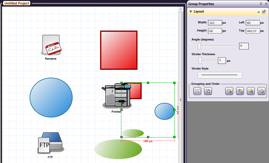
In the following illustration, the three objects that were sent to back (above) have been grouped:
Node Text
On the Text section of the Properties panel, you can configure the font family, size, style, and alignment of the text.
Node Color
On the Color section of the Properties panel, you can configure the color for the text, line, or background of the object.
Copy and Paste Nodes
The following special paste options become available if you copy a Node (ex: the Input or Output folder): Paste Duplicate and Paste Original. You will get these special menu options, only when you select Nodes to Copy. Copying any other element, such as rectangles, text boxes, circles, etc. will allow for only the Paste Duplicate option. If you copy a mixture of nodes and objects, they will also be constrained to Paste Duplicate.
Paste Duplicate will create an independent copy of the node, which will have the same properties until you edit them to make a unique node. If you make a change to this duplicate copy, the changes will not affect the original, copied node.
Paste Original will create another of the same node. If changes are made to the pasted (reference) node, they will simultaneously be applied to the Original node.
Node Label or Text Box
The Text section of the Properties panel becomes available when you have selected either a node (which has a label), or a text box. Use the Text section to change the font, size, style, or justification.