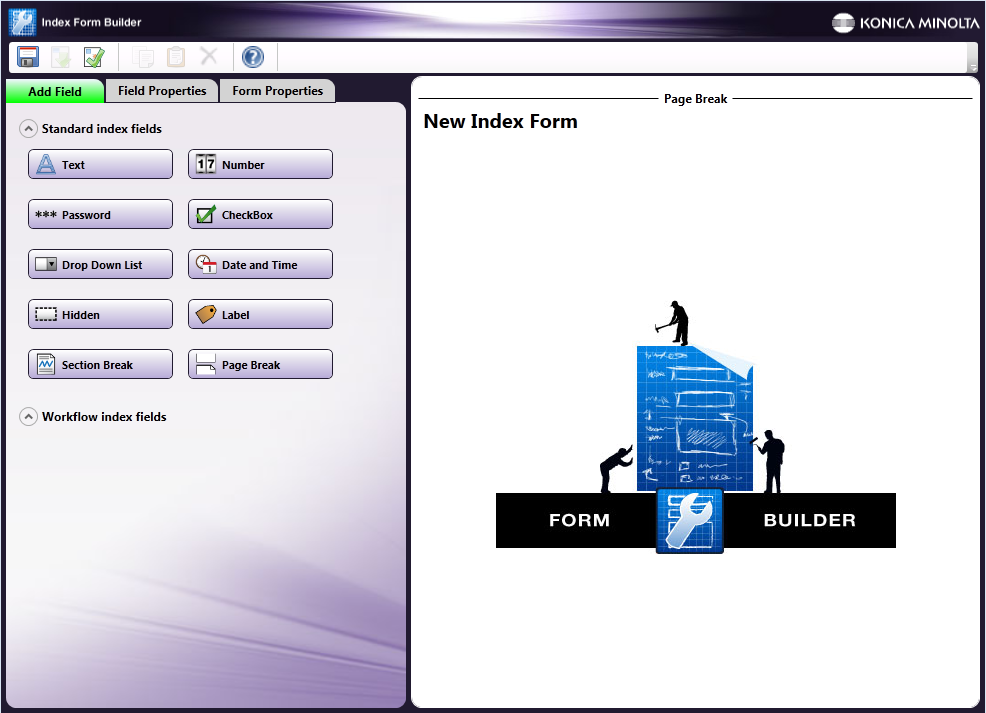
Index Form Builder
Use the Index Form Builder to create interactive forms for use on the MFP panel. Using an indexing form at the MFP, you can enter identifying information about your scanned documents as well as choose additional options, such as conversion formats and specific scan destinations.
When designing a form using the Index Form Builder, you can define the following:
-
Text, number, and password fields
-
Check boxes
-
Drop-down lists that display:
-
Customized list items
-
Root folders and subdirectories for folder browsing
-
Database entries from an ODBC data source
-
-
Hidden fields that, although not visible on the MFP, can store values to be used by other fields on the form or nodes in the workflow.
-
Labels, section headings, and page breaks
Important! The Index Form Builder creates forms that can be used in many different interfaces, including at the MFP, on a mobile device, and in Dispatcher Web. Some features available within the Index Form Builder may be restricted by limitations of the medium.
Note: Index forms running on an MFP’s Native User Interface may display truncated field labels due to MFP limitations.
Accessing the Index Form Builder
You can access the Index Form Builder from either the MFP Panel node, Workflow Builder, or the Main Application Screen. You can also import existing forms into your workflow or MFP Panel node.
Creating New Index Forms Not Associated with a Specific Workflow
Select the Index Form Builder from the Tools menu on the Main Application Screen. A blank index form appears.
This instance of the Index Form Builder is a standalone tool. You can import forms created using this tool into workflows at a later date.
Creating New Index Forms Associated with a Specific Workflow
Do the following:
-
Access the Index Form Builder by doing one of the following:
-
On the MFP Panel node’s properties window, check the Attach Index Form box, then click on the + button. The Create New Index Form window appears.
-
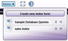
From the Workflow Builder, select the Forms button. On the drop-down palette that appears, select the Create new form button to create a new form. The drop-down palette also lists any existing forms that are associated with the workflow. You can edit or remove these forms, using the icons listed next to the form, as in the following illustration:
-
-
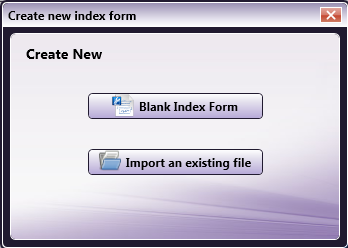
On the Create New Index Form window, select the Blank Index Form button, as in the following illustration:
Importing an Existing Index Form
You can import existing index forms (*.wfxf files) into your MFP Panel node. Do the following:
-
On the MFP Panel node’s properties window, check the Attach Index Form box. Then click on the + button. The Create New Index Form window appears.
-
On the Create New Index Form window, select the Import an existing file button.
-
Choose the .wfxf file from the Open window that appears. Then select the Open button.
Editing an Existing Index Form from the MFP Panel Node
You can also edit existing index forms that are associated with your workflow. Do one of the following:
-
On the MFP Panel node’s properties window, check the Attach Index Form box.
-
Select the appropriate workflow from the drop-down list. Then click on the Edit (
 ) button.
 -
From the Workflow Builder, select the Forms button. Then choose an existing workflow from the drop-down list.
Removing an Index Form from the MFP Panel Node
-
To remove an index form from a MFP Panel node, check the Attach Index Form box on the MFP Panel node properties window.
-
Select the appropriate workflow from the drop-down list. Then click on the Delete (
 ) button.
 -
Select Yes on the confirmation button that appears.
Components of the Index Form Builder
Tool Bar
Using the tool bar, you can do the following:
| Icons | Description |
|---|---|
 |
Open the Create new index form window. This option is available only in the standalone Index Form Builder that is accessed from Dispatcher Phoenix’s Main Application Screen. |
 |
Open an existing form. This option is available only in the standalone Index Form Builder that is accessed from Dispatcher Phoenix’s Main Application Screen. |
 |
Save the form. Forms are saved with a file extension of *.wfxf. |
 |
Export the form. |
 |
Validate the form’s fields. Validation messages display in an Error List area on the work area. |
 |
Copy a selected form field. |
 |
Paste a form field that has been copied. |
 |
Delete a selected form field. |
 |
Browse for metadata. |
 |
View help information about the Index Form Builder. |
Index Fields
You can add the following fields to your form:
| Fields | Description |
|---|---|
 |
A text field allows the user to input text about the scanned document(s), such as document name or vendor name. |
 |
A number field allows the user to input a number, such as an invoice number or user ID. |
 |
A password field allows the user to enter a password to be associated with the document. Anything entered into the Password field is automatically masked. |
 |
A check box provides the user with a True/False option. For example, a user can choose whether or not to convert the document to Searchable PDF format. Because of the real estate limitations of the MFP control panel, check boxes are represented on the panel as two buttons. |
 |
A drop-down list allows the user to choose an item from a list. This drop-down list can be automatically pre-populated with folders or database entries, or you can manually create the list with specific items. |
 |
A date and time field allows the user to associate the date and/or time with the scanned documents. |
 |
A hidden field can be used to store the results of other fields or default values that need to be associated with the document but do not need to be displayed to the MFP user. |
 |
A label is static text to be displayed on the form. |
 |
A section break divides the index form into different headings. |
 |
A page break divides the index form into different screens on the MFP. |
Workflow Index Fields
When the Index Form Builder is launched from the Workflow Builder (either via the MFP Panel node or by selecting from the Forms button), buttons that represent nodes in the workflow appear in the Workflow Index Fields section. You can drag and drop those buttons onto the Index Form work area to add them to your form. For example, to allow the user to specify an output directory for their scanned documents, drag-and-drop the Output Folder button onto the Index Form work area.
One of the workflow index fields that you can define on your index form is for SharePoint. Once you drag-and-drop a SharePoint node button onto the Index Form work area, a list of SharePoint configuration fields appears that match the configuration fields in the SharePoint Distribution node. If the SharePoint Distribution node has already been configured, the fields in the Index Form will populate with default values.
Getting Started
When you open a new index form, a blank form appears in the workflow with the default title of “New Index Form.” To customize the name of the form, do one of the following:
-
Click on the Form Properties tab and enter a name in the Form Title field, or
-
Select the default title on the Index Form’s work area. In the Page Title field, enter a name for the index form.
Adding Index Fields to the Work Area
You can begin adding fields to your form by dragging-and-dropping the buttons listed on the left hand side of the window into the Index Form Builder’s work area. You can also double-click on the buttons to add them to the work area.
The following icons may appear next to fields in the work area:
 - Indicates that the field is a workflow index field.
 - Indicates that an event is associated with the field.
Deleting Index Fields from the Work Area
Once in the work area, each index field includes a Delete button underneath it. To delete an index field from your form, select that Delete button. Then select Yes on the confirmation message that appears.
Moving Index Fields around the Work Area
You can rearrange the order of the index fields by dragging and dropping the fields on the work area.
Configuring Index Fields
When you select a field on the Index Form Builder’s work area, the properties for the selected field appear on the left-hand side of the window. This is where you can configure the field to suit your purposes.
Exporting Index Forms
You can export your index form to use in other workflows. This feature is available in the Index Form Builder that is launched from the Workflow Builder as well as the Index Form Builder that is used as a standalone tool. To export your index form, select the Export button on the Index Form Builder’s tool bar.
Note: If the form includes any workflow fields, those fields will be converted to standard index fields when you export the index form. A warning message about this will appear before the export operation completes.
Adding a Text Field
To add a text field to your form, drag and drop the Text button to the Index Form’s work area. To customize its properties, select the newly created text field.
You can do the following:
-
In the Variable Name field, enter an internal, identifying name for the field that can be referenced by other nodes in the workflow or other fields on the form. The variable name will not be visible to users at the MFP. Spaces are not allowed and will be replaced by underscores (_) if entered. All variable names in an index form must be unique.
This variable name can be referenced later by other nodes in the workflow or other fields using the following syntax: {form:[name of variable]} (e.g., if the variable name is ‘name,’ the variable name could be referenced in other nodes using this syntax {form:name}).
The variable name will be listed to the right of the field in the Index Form Builder’s work area.
-
In the Friendly Name field, enter the text that will appear above the text field on the MFP. The Friendly Name will always be visible to users at the MFP.
-
In the Default Value field, specify default text that will appear in the field when the form first loads.
-
In the Min Length and Max Length fields, specify a minimum and maximum number of characters that can be entered.
-
In the Options area, you can specify the following:
-
Required - Set as a mandatory input field.
-
Read only - Set as a read only field that cannot be changed.
-
Sticky - Keep values in the field across all documents in the batch.
-
Mask input - Mask any text entered by the user.
-
Allow duplicates - Allow the user to duplicate the field on the MFP panel. Once this option is enabled, a + button will appear next to the field in the Index Form Builder and on the MFP control panel. The MFP user would tap on the + button to duplicate the field. If a required field is duplicated, a red star (*) will not appear next to the duplicated field on the MFP panel.
-
Exclude from metadata - Do not include the variable as metadata associated with the document.
-
Add help text - Supply help information about the field. This help information will be accessed on the MFP when the user taps a question mark icon next to the field. When this option is enabled, an “Edit help text” box will appear on which you can enter text.
-
Add action button - Add a button to appear next to the field. You can define the behavior for this button when it is tapped on the MFP panel. Note that the Action button does not appear if the form is displayed on an MFP with a native User Interface, in this case, events are triggered when the user changes the contents of the field. When this option is enabled, you are allowed to modify the default text of “Caption” on the Action button by editing the text in the Action Button Caption field.
-
Add lookup – Display tabular data with multiple columns while indexing. When this option is enabled, you can set up an ODBC lookup query, choose the columns to display, and then specify the sequence of steps to take once an item has been selected.
Important! The “Minimum length of text to trigger a lookup” feature is not supported at the MFP. The workflow will begin the lookup after the first keystroke.
-
In the Add Events area, associate events with the field.
-
Adding a Number Field
To add a numeric field to your form, drag and drop the Number button to the Index Form’s work area. To customize its properties, select the newly created number field.
You can do the following:
-
In the Variable Name field, enter an internal, identifying name for the field. The variable name will not be visible to users at the MFP. Spaces are not allowed and will be replaced by underscores (_) if entered. All variable names in an index form must be unique.
This variable name can be referenced later by other nodes in the workflow or other fields using the following syntax: {form:[name of variable]} (e.g., if the variable name is ‘name,’ the variable name could be referenced in other nodes using this syntax {form:name}).
The variable name will be listed to the right of the field in the Index Form Builder’s work area.
-
In the Friendly Name field, enter the text that will appear above the number field on the MFP. The Friendly Name will always be visible to users at the MFP.
-
In the Default Value field, specify the value that will appear in the field when the form first loads.
-
On the MFP Native User Interface: The field will be populated with 0 if a default value is not given.
-
On the MFP Graphical User Interface: The field will be left blank if a default value is not given.
-
-
In the Min Value and Max Value fields, specify a minimum and maximum number of numbers that can be entered.
-
In the Options area, you can specify the following:
-
Required - Set as a mandatory input field.
-
Read only - Set as a read only field that cannot be changed.
-
Sticky - Keep values in the field across all documents in the batch.
-
Mask input - Mask any text entered by the user.
-
Allow duplicates - Allow the user to duplicate the field on the MFP panel. Once this option is enabled, a + button will appear next to the field in the Index Form Builder and on the MFP control panel. The MFP user would tap on the + button to duplicate the field. If a required field is duplicated, a red star (*) will not appear next to the duplicated field on the MFP panel.
-
Exclude from metadata - Do not include the variable as metadata associated with the document.
-
Add help text - Supply help information about the field. This help information will be accessed on the MFP when the user taps a question mark icon next to the field. When this option is enabled, an “Edit help text” box will appear on which you can enter text.
-
-
In the Add Events area, associate events with the field.
Adding a Password Field
To add a password field to your form, drag and drop the Password button to the Index Form’s work area. To customize its properties, select the newly created password field.
You can do the following:
-
In the Variable Name field, enter an internal, identifying name for the field that can be referenced by other nodes in the workflow or other fields on the form. The variable name will not be visible to users at the MFP. Spaces are not allowed and will be replaced by underscores (_) if entered. All variable names in an index form must be unique.
This variable name can be referenced later by other nodes in the workflow or other fields using the following syntax: {form:[name of variable]} (e.g., if the variable name is ‘name,’ the variable name could be referenced in other nodes using this syntax {form:name}).
The variable name will be listed to the right of the field in the Index Form Builder’s work area.
-
In the Friendly Name field, enter the text that will appear above the password field on the MFP. The Friendly Name will always be visible to users at the MFP.
-
In the Min Length and Max Length fields, specify a minimum and maximum number of characters that can be entered.
-
In the Options area, you can specify the following:
-
Required - Set as a mandatory input field.
-
Sticky - Keep values in the field across all documents in the batch.
-
Allow duplicates - Allow the user to duplicate the field on the MFP panel. Once this option is enabled, a + button will appear next to the field in the Index Form Builder and on the MFP control panel. The MFP user would tap on the + button to duplicate the field. If a required field is duplicated, a red star (*) will not appear next to the duplicated field on the MFP panel.
-
Exclude from metadata - Do not include the variable as metadata associated with the document.
-
Add help text - Supply help information about the field. This help information will be accessed on the MFP when the user taps a question mark icon next to the field. When this option is enabled, an “Edit help text” box will appear on which you can enter text.
-
-
In the Add Events area, associate events with the field.
Adding a Check Box
To add a checkbox to your form, drag and drop the Checkbox button to the Index Form’s work area. To customize its properties, select the newly created checkbox.
You can do the following:
-
In the Variable Name field, enter an internal, identifying name for the field that can be referenced by other nodes in the workflow or other fields on the form. The variable name will not be visible to users at the MFP. Spaces are not allowed and will be replaced by underscores (_) if entered. All variable names in an index form must be unique.
This variable name can be referenced later by other nodes in the workflow or other fields using the following syntax: {form:[name of variable]} (e.g., if the variable name is ‘name,’ the variable name could be referenced in other nodes using this syntax {form:name}).
The variable name will be listed to the right of the field in the Index Form Builder’s work area.
-
In the Friendly Name field, enter the text that will appear above the check box on the MFP. The Friendly Name will always be visible to users at the MFP.
-
Customize the labels for the buttons that will appear on the MFP in the True Button Label and False Button Label fields.
-
In the Options area, you can specify the following:
-
Check by default - Select the “True” button automatically when the form first loads.
-
Read only - Set as read only buttons that cannot be changed.
-
Sticky - Keep values in the field across all documents in the batch.
-
Allow duplicates - Allow the user to duplicate the checkbox on the MFP panel. Once this option is enabled, a + button will appear next to the checkbox in the Index Form Builder and on the MFP control panel. The MFP user would tap on the + button to duplicate the checkbox buttons. If a required field is duplicated, a red star (*) will not appear next to the duplicated field on the MFP panel.
-
Exclude from metadata - Do not include the variable as metadata associated with the document.
-
Add help text - Supply help information about the field. This help information will be accessed on the MFP when the user taps a question mark icon next to the field. When this option is enabled, an “Edit help text” box will appear on which you can enter text.
-
Adding a Drop-down List
To add a drop-down list to your form, drag and drop the Drop Down List button to the Index Form’s work area. To customize its properties, select the newly created drop-down list.
You can do the following:
-
In the Variable Name field, enter an internal, identifying name for the field that can be referenced by other nodes in the workflow or other fields on the form. The variable name will not be visible to users at the MFP. Spaces are not allowed and will be replaced by underscores (_) if entered. All variable names in an index form must be unique.
This variable name can be referenced later by other nodes in the workflow or other fields using the following syntax: {form:[name of variable]} (e.g., if the variable name is ‘name,’ the variable name could be referenced in other nodes using this syntax {form:name}).
The variable name will be listed to the right of the field in the Index Form Builder’s work area.
-
In the Friendly Name field, enter the text that will appear above the drop-down list on the MFP. The Friendly Name will always be visible to users at the MFP.
-
In the Options area, you can specify the following:
-
Required - Set as a mandatory field.
-
Read only - Set as a read only field that cannot be changed.
-
Sticky - Keep values in the field across all documents in the batch.
-
Allow duplicates - Allow the user to duplicate the field on the MFP panel. Once this option is enabled, a + button will appear next to the field in the Index Form Builder and on the MFP control panel. The MFP user would tap on the + button to duplicate the field. If a required field is duplicated, a red star (*) will not appear next to the duplicated field on the MFP panel.
-
Multi select - Allow the MFP user to choose more than one item from the list at a time.
-
Buttons list - Displays drop-down list items as buttons on the MFP panel.
-
Exclude from metadata - Do not include the variable as metadata associated with the document.
-
Add help text - Supply help information about the field. This help information will be accessed on the MFP when the user taps a question mark icon next to the field. When this option is enabled, an “Edit help text” box will appear on which you can enter text.
-
-
In the Add Events area, associate events with the field.
Manually Adding List Items
If you do not want to populate the drop-down list with folder locations or database entries, you can manually define the items to be displayed in the drop-down list by doing the following:
-
In the List Values area, click on the + button and an empty field will appear, as in the following illustration:
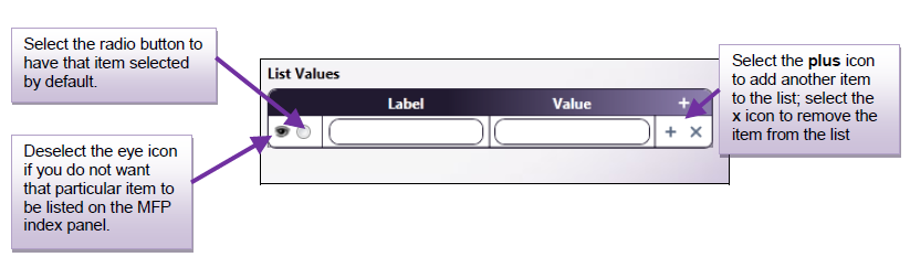
-
In the Label field, enter a ‘friendly name’ for the list item. This text will be visible to the user on the MFP panel.
-
In the Value field, enter a unique value for the list item. This value can be referenced in other nodes in the workflow.
For example:
-
Converting scanned documents to other formats. You can allow users to choose from a wider range of file formats for their scanned documents, such as Microsoft Word, Microsoft Excel, and Microsoft PowerPoint. To do so, you would define list items for each file type. For the Word option, the label could be “MS Word” and the value could be “word.” That value can be referenced in a Metadata Route node to route incoming files to the Convert to Office node.
-
Allowing user to scan to a limited list of directories. Instead of using folder browsing, you could manually enter a limited number of available locations to which documents can be distributed. Again, the label would be friendly text for the user, such as “Desktop” and its value could be its corresponding directory path.
-
Adding Date/Time
To add a field for the user to enter the date and/or time at the MFP panel, drag and drop the Date and Time button to the Index Form’s work area. This information will be associated with the file as metadata. To customize its properties, select the newly created date/time field.
You can do the following:
-
In the Variable Name field, enter an internal, identifying name for the field that can be referenced by other nodes in the workflow or other fields on the form. The variable name will not be visible to users at the MFP. Spaces are not allowed and will be replaced by underscores (_) if entered. All variable names in an index form must be unique.
This variable name can be referenced later by other nodes in the workflow or other fields using the following syntax: {form:[name of variable]} (e.g., if the variable name is ‘name,’ the variable name could be referenced in other nodes using this syntax {form:name}).
The variable name will be listed to the right of the field in the Index Form Builder’s work area.
-
In the Friendly Name field, enter the text that will appear above the date/time field on the MFP. The Friendly Name will always be visible to users at the MFP.
-
From the Display type drop-down list, choose the type of information you are trying to gather: Time, Date, or Date and Time.
-
From the Return Format drop-down list, choose the format to use when writing to the index file. You can also type a format directly into this field; however, it must be in a known format in order to validate.
-
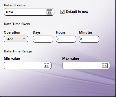
In the Default Value field, choose or enter a default value for the field. You can click on the calendar icon to access a pop-up calendar or time clock as in the following illustration.
-
If you check the Default to now box, the current date/time will be displayed, and the Date Time Skew will be enabled.
-
In the Date Time Skew section, under Operation you can choose to either add or subtract days, hours or minutes from the Default value.
-
In the Date/Time range Min value and Max value fields, you can specify minimum and maximum values for the date or time, using the calendar icons to access calendar or time clock pop-ups. You will not be allowed to scan outside of the maximum value range.
-
In the Options area, you can specify the following:
-
Required - Set as a mandatory field.
-
Read only - Set as a read only field that cannot be changed.
-
Sticky - Keep values in the field across all documents in the batch.
-
Allow duplicates - Allow the user to duplicate the field on the MFP panel. Once this option is enabled, a + button will appear next to the field in the Index Form Builder and on the MFP control panel. The MFP user would tap on the + button to duplicate the field. If a required field is duplicated, a red star (*) will not appear next to the duplicated field on the MFP panel.
-
Exclude from metadata - Do not include the variable as metadata associated with the document.
-
Add help text - Supply help information about the field. This help information will be accessed on the MFP when the user taps a question mark icon next to the field. When this option is enabled, an “Edit help text” box will appear on which you can enter text.
-
-
In the Add Events area, associate events with the field.
Adding a Hidden Field
To add a hidden field to your form, drag and drop the Hidden button to the Index Form’s work area. To customize its properties, select the newly created hidden field.
Hidden fields are used as temporary variables to store values that can be re-used in the index form. For example, several connectors (e.g., Box Connector, SharePoint Connector) use the AuthScheme hidden field to track the type of authentication scheme that is supported by the server. Note that the AuthScheme field is used internally for communication and requires no user input.
You can do the following:
-
In the Variable Name field, enter an internal, identifying name for the field that can be referenced by other nodes in the workflow or other fields on the form. The variable name will not be visible to users at the MFP. Spaces are not allowed and will be replaced by underscores (_) if entered. All variable names in an index form must be unique.
This variable name can be referenced later by other nodes in the workflow or other fields using the following syntax: {form:[name of variable]} (e.g., if the variable name is ‘name,’ the variable name could be referenced in other nodes using this syntax {form:name}).
The variable name will be listed to the right of the field in the Index Form Builder’s work area.
-
In the Default Value field, specify the value that will appear in the field when the form first loads.
-
In the Options area, you can specify the following:
-
Exclude from metadata - Do not include the variable as metadata associated with the document.
-
In the Add Events area, associate events with the field.
-
Adding Static Text
To add static text to the form, drag a Label icon onto your work area. Default text of “Label goes here” will appear. To customize this newly created element, select it and you can edit the text in the Friendly Name field.
Adding a Section Heading
To add a section heading to the form, drag a Section Break icon onto your work area. Default text of “Section Heading” will appear. To customize this newly created element, select it and you can edit the text in the Section Heading field. You can also enable the Allow duplicates option to allow the user to duplicate the section on the MFP panel. Once this option is enabled, a + button will appear next to the section in the Index Form Builder and on the MFP control panel. The MFP user would tap on the + button to duplicate the field. If a required field is duplicated, a red star (*) will not appear next to the duplicated field on the MFP panel.
Adding a Page Break
To add a new page to the form, drag a Page Break icon onto your work area. Default text of “Page Title” will appear. To customize this newly created element, select the page break.
You can do the following:
-
In the Variable Name field, enter an internal, identifying name for the field that can be referenced by other nodes in the workflow or other fields on the form. The variable name will not be visible to users at the MFP. Spaces are not allowed and will be replaced by underscores (_) if entered. All variable names in an index form must be unique.
This variable name can be referenced later by other nodes in the workflow or other fields using the following syntax: {form:[name of variable]} (e.g., if the variable name is ‘page1,’ the variable name could be referenced in other nodes using this syntax {form:page1}).
The variable name will be listed to the right of the field in the Index Form Builder’s work area.
-
In the Page title field, enter the text that will appear at the top of the screen on the MFP.
-
In the Options area, you can specify the following:
-
Hide back button - Do not display the back arrow on this screen.
-
Hide next button - Do not display the forward arrow on this screen.
-
Hide scan button - Do not display the scan button on this screen.
-
Hide home button - Do not display the home icon button on this screen.
-
Hide return button - Do not display the button on this screen.
-
Hide page numbers - Do not display the page number on this screen.
-
Add help text - Supply help information about the field. This help information will be accessed on the MFP when the user taps a question mark icon next to the field. When this option is enabled, an “Edit help text” box will appear on which you can enter text.
-
Expand String Configuration
The Expand String configuration window is used to expand the value of variables listed in associated index fields. It does not require any special configuration; however, there is an option for customizing the Expand String query’s friendly name.
To change the friendly name, enter a new name in the text field provided. Then select the Save button to close the window. Any changes made to the friendly name will be immediately reflect on the Index Form Builder.
Overview of Events
You can associate an event or sequence of events to occur under the following circumstances:
- On load - An action or series of actions triggered when the form first loads onto the MFP panel.
- On notified - An action or series of actions triggered when the field is notified by another field.
- On selection change - An action or series of action triggered when a selection has been made at the MFP panel. Note that when a form is initially loaded on the MFP panel, the selection change event will not be triggered until the user actively changes a selection in a text box.
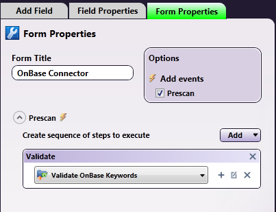
- Prescan - An action or series of action triggered when the scan button is selected. This option is available from the Form Properties tab and is used to validate keywords entered for either SharePoint or OnBase.
Defining a Prescan Event
To validate OnBase keywords that have been entered when the Scan button is selected, you can define a Prescan event for the form. Do the following:
-
Click on the Form Properties tab.
-
Check the Prescan box in the Options area.
-
Choose Validate from the Add button’s drop-down list.
-
Choose OnBase Data Source from the + button’s drop-down list.
-
Configure the OnBase Data Source to Validate OnBase Keywords.
Adding an On Action Button Click Event
When defining a text field, you can add a button next to the field that allows the user to browse through folders or database entries, choose from a list of database entries, or perform another action based on user input to the text field.
To add an On Action Button Click Event, do the following:
-
Add a text field to your form.
-
On the text field’s properties panel, check the Add action button box under Options. An empty On Action Button Click Event drop-down list will appear along with an On Action Complete drop-down list, as in the following illustration:
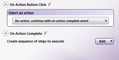
-
You can associate the following with this button:
-
Folder Browsing, or
-
Windows Explorer-like view of folders, or
-
Future actions to be performed based on user input to text field.
-
On Action Button Click - Browsing
To associate some kind of browsing with the Action button, do the following:
-
Select Show Folder Browser View or Show Explorer View from the Select an action drop-down list.
-
Click on the + in the Select a data source to associate with the view box. Then select Folder Browser Data Source or SharePoint Data Source. This will open the specific Configuration window from which you can specify what you would like to display on the MFP panel (e.g., folders, SharePoint libraries, etc.)
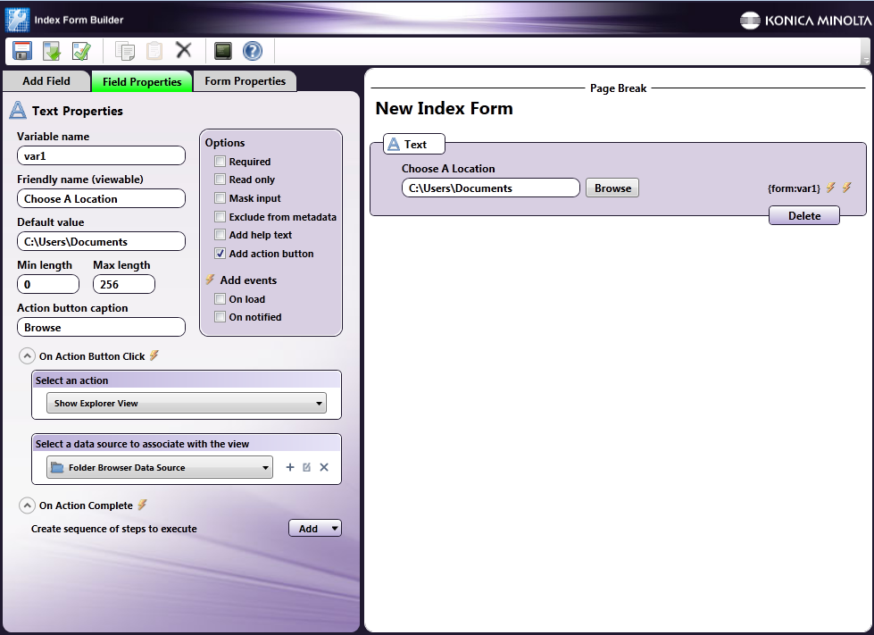
For Example:
A text field can be defined with the following attributes:
-
A label of “Choose A Location” (enter “Choose A Location” in the text field’s Friendly Name field).
-
An Action button labeled “Browse” (enable the Add action button option under the text field’s Options and enter “Browse” in the Action button caption field).
-
An Explorer Browser view with the Root Folder of C:/Users and a Default Folder of C:/Users/Documents (by choosing Show Explorer View from the Select an action drop-down list. Then select Folder Browser Data Source from the Select a data source drop-down list. This opens up the Folder Browser Configuration window).
The Index Form would resemble the following illustration:
-
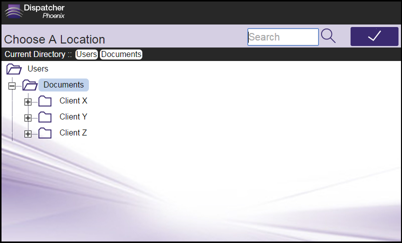
At The MFP Panel:
At the MFP panel, the user would see a screen with the text field and action button labeled Browse. When the user taps on the Browse button, another screen would appear, displaying the subfolders underneath the default folder. In this case, ClientX, ClientY, and ClientZ are subfolders on the default folder C:\Users\Documents. See the following illustrations:
On Action Button Click - On Action Complete
To associate the Action Button with an action that will be performed based on user input in the text field, choose the No action, continue with on action complete event option. This option is used to populate other fields or drop-down lists based on what the user enters in the text field. For example, if the user enters an employee ID in the text field and taps on the Action button, another field could then be populated with the employee’s last name, based on a database query.
Do the following:
-
Select No action, continue with on action complete event from the Select an action drop-down list.
-
In the On Action Complete area, create the steps that should run once the user inputs text into the field and taps on the Action button. Triggers are:
-
Query - Use to set up a query on a data source.
-
Notify - Use to notify another field on the index form of a specific action or event.
-
Set Value - Use to update a field based on user input or selection at the MFP.
-
Set List - Use to populate a drop-down list with the results of a data source query.
-
Goto Page - Use to automatically display another page in the index form after a specific event occurs.
-
Show Alert - Use to automatically display a warning message after a specific event occurs.
-
Expand Section - Use to signify a placeholder for dynamically created fields (e.g., keywords in SharePoint).
For Example:
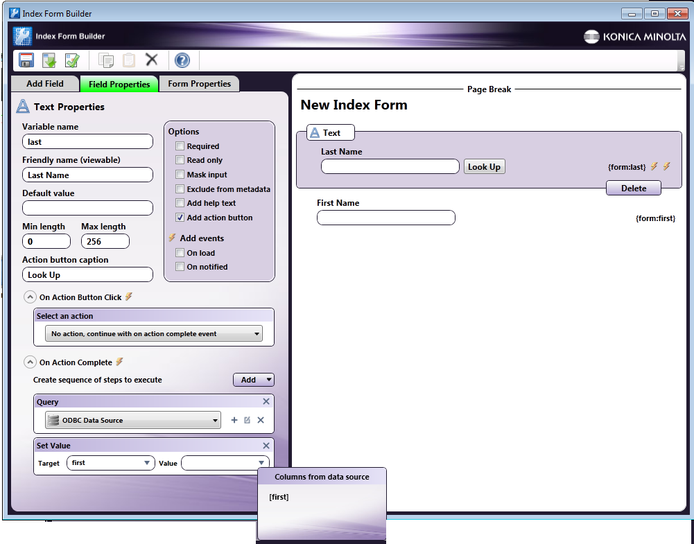
If you have a database with two columns (first and last) for first names and last names, you can set up your index form so that the first name of an employee is automatically populated on another field on the MFP panel based on what last name was entered at the panel.
In this case, two text fields should be set up: one for the last name (with a variable name of ‘last’) and one for the first name (with a variable name of ‘first’).
The ‘last’ text field can be defined with the following attributes:
-
A label of “Last Name” (by entering “Last Name” in the text field’s Friendly Name field)
-
An Action button labeled “Look Up” (by enabling the Add action button option under the text field’s Options and entering “Look Up” in the Action button caption field).
-
The No Action, continue with on action complete event option enabled (by choosing from the Select an action drop-down list).
-
An ODBC database query performed after On Action Complete (by choosing Add > Query in the On Action Complete area and then choosing an ODBC data source for the query. The SQL query should be set up to retrieve the first name that is associated with the last name that was entered at the MFP panel as follows:
SELECT [first] FROM [customers] WHERE last=’{form:last}’
Where:
[first] is the name of the column that contains all first names
[customers] is the name of the table
last is the name of the column that contains all last names
{form:last} references what was entered at the MFP for the last name.
-
-
A Set Value trigger that will populate the ‘first’ text field with the value pulled from the ODBC data source query. When defining the Set Value trigger, use the down arrows on the Target and Value fields to choose a field its corresponding value. See the following illustration:
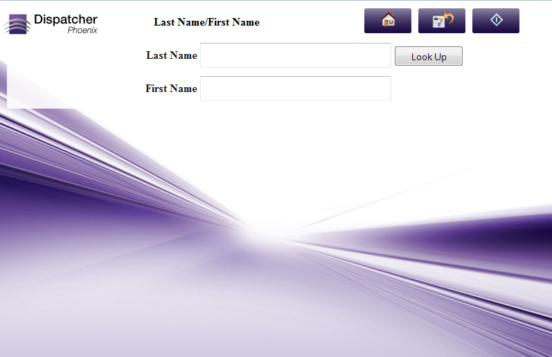
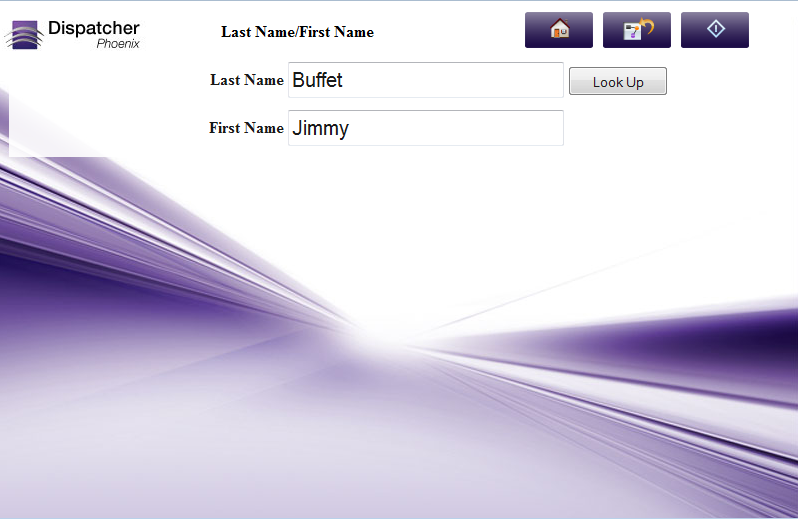
At The MFP Panel:
At the MFP panel, the user would see a screen with two text fields and an action button. When the user inputs a last name in the Last Name field and taps on Look Up, the First Name field would be automatically populated based on the database query. See the following illustrations:
Defining a Query
One of the events that can be defined is a query. You can query:
- ODBC data sources
- LDAP servers for Email Lookup
- Folders
- Dynamic variables
- Microsoft SharePoint document management system
- Box.com
- WebDAV Servers
- Dropbox
- OneDrive
- OneDrive for Business
- Google Drive
- FilesAnywhere
- FileAssist
To get started, choose Query from the Add button and clicking on the + icon in the Query box. A menu will then appear with these options.
Database Browsing - ODBC Database Configuration
Once you choose ODBC Data Source from the new Query drop-down list that appears, the ODBC Data Source Configuration window will appear, which allows you to connect to a database and run custom queries to retrieve specific records from the database.
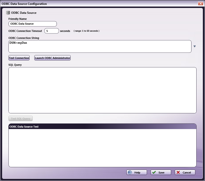
On this window, do the following:
-
Enter an identifying name for this specific data source query in the Friendly Name field.
-
Specify a time period (in seconds) for the connection to be established before ending the attempt in the ODBC Connection Timeout field.
-
Enter a connection string to connect to the appropriate data source in the ODBC Connection String area. The application comes with a list of default strings that you can select and then customize for your system. Click on the down arrow to view and select from a list of strings.
-
To make sure that the connection string you entered is valid, select the Test Connection… button.
-
If the connection is valid, data will appear in the ODBC Data Source Test area.
-
If the connection is invalid, error messages will appear in the ODBC Data Source Test area.
-
-
To manage database drivers and data sources, select the Launch ODBC Administrator button. Refer to Microsoft Windows documentation for more information on that dialog box.
-
To submit SQL queries to the data source, enter SQL statements in the SQL Query area.
-
To make sure your SQL statements are retrieving the correct records from the data source, select the Test SQL Query button. Note that you can add form variables to the SQL query.
For Example:
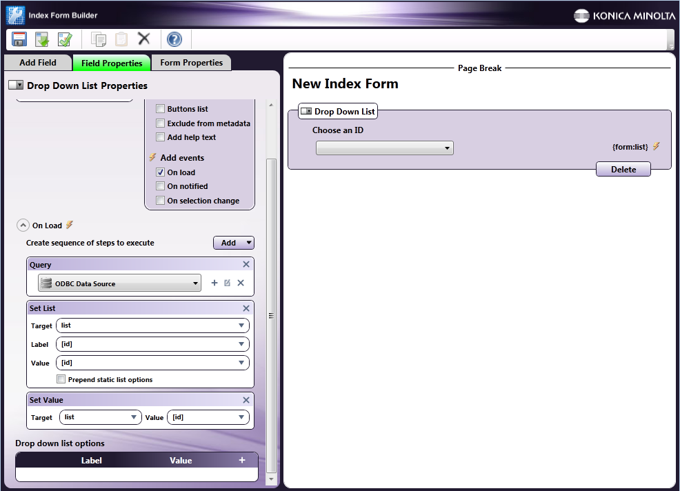
You can set up a database query to automatically populate a drop-down list with a list of values once the form is loaded on the MFP panel.
In this case, the drop-down list field can be defined with the following attributes:
-
A variable name of ‘list’ (by entering ‘list’ into the Variable name field).
-
A label of ‘Choose an ID’ (by entering ‘Choose an ID’ into the Friendly name field).
-
An On Load event enabled (by checking the On Load box under the Add Events area).
-
An ODBC data source query (by choosing Add > Query in the On Load section and then choosing an ODBC data source). The SQL Query should retrieve the ‘id’ column in the ‘customers’ data range of the table, using the following SQL statement:
SELECT [id] FROM [customers]
-
A Set List trigger in which the drop-down list is populated with the results of the query. When defining the Set List trigger, you can use the down arrows to choose column names from the data source.
-
A Set Value trigger that pre-selects the first item in the list when the form is first loaded. When defining the Set Value trigger, you can use the down arrows to choose column names from the data source.
The Index Form Builder should resemble the following illustration:
At the MFP Panel:
At the MFP panel, the user would see a drop-down list pre-populated with ID numbers, as in the following illustration:
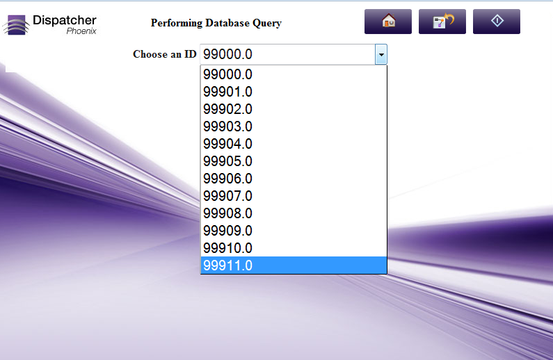
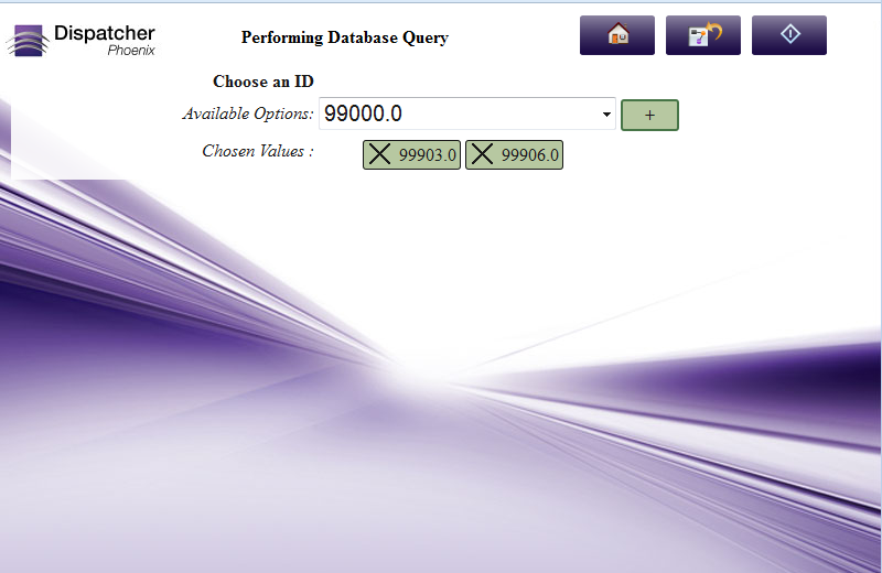
MULTI-SELECT EXAMPLE:
If you have specified a “Multi-Select” option for your drop-down list, the screen on the MFP will display a + sign to help you select multiple items from the list, as in the following illustration:
-
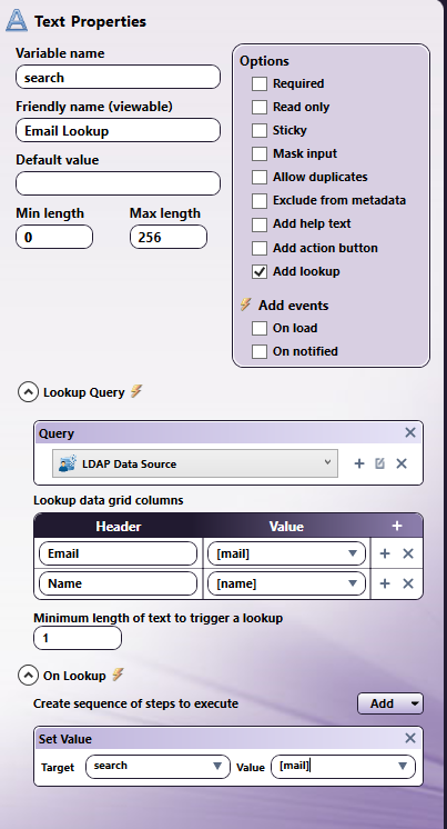
Creating an LDAP Query for Email Lookup
You can create an index form that allows users to easily enter or retrieve LDAP user email addresses at the MFP panel. These addresses can then receive scanned documents via email. This feature includes “type ahead” functionality, which automatically displays results from the LDAP server based on characters you enter into the field.
To create this “Scan to Me” functionality with LDAP Email Lookup, you must configure your index form to perform an LDAP Query, which looks up the email address in the LDAP directory.
Configuring LDAP Data Source
First, add an LDAP Data Source Query to your index form. Do the following:
-
In the Index Form Builder, drag-drop a Text field onto the Canvas area.
-
Under Options, check the Add lookup box for that text field. The Lookup Query fields appear.
-
From the Query drop-down list, select the + (Add) button. Then, select LDAP Data Source from the drop-down list that appears.
-
The LDAP Data Source Configuration window appears. From this window, connect to the LDAP Server and set up your query parameters. See the following illustration:
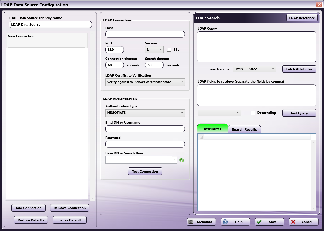
The next sections describe how to set up the LDAP Data Source Configuration window. When done with LDAP configuration and queries, select the Save button.
Connections
When you open the window for the first time, an available “New Connection” will display in the left column. You may use the buttons at the bottom of the area to modify connections:
- Add Connection - Add a new LDAP connection. Dispatcher Phoenix supports up to 10 separate connections.
- Save as Default Set - Saves the current configuration as the default.
- Restore Defaults - Resets the selected LDAP connection to the previously-selected default setting. Note that the Save as Default button must have been clicked first.
Each connection displays information about the connection and includes an X button to delete the connection. Connections can be reordered by dragging and dropping them within the Connections area.
LDAP Connection
In the LDAP Connection area, enter the information needed to connect to your company’s LDAP server.
- Host – Enter the name of the server where LDAP is hosted.
- Port – Enter the LDAP server port.
- Version – Select the LDAP version from the drop-down list. Note that Version 3 (the default setting) is backward-compatible to versions 1 and 2. For this reason, we recommend you keep the default setting.
- SSL – Select this box to require the LDAP server to make an SSL-encrypted connection.
- Connection timeout – Enter the maximum number of seconds to establish an LDAP connection. If no connection is made in the allotted time, the connection terminates.
- Search timeout – Enter the maximum number of seconds to search for LDAP data before abandoning the search.
- LDAP Certificate Verification - If you check the box at the SSL field, use this field to specify your method of LDAP server certificate verification. You have the following options:
- Verify against Windows certificate store - This option verifies the LDAP server certificate using the certification authorities set in Windows. If you select this option, ensure a valid LDAP server certificate issued by a trusted certificate authority is installed on the domain server.
- Ignore verification, this is a trusted server - We recommend this option for self-signed certificates. This option accepts any certificate for a TLS connection.
LDAP Authentication
In the LDAP Authentication area, enter the LDAP account information and test the connection. Follow these steps:
-
Choose an authentication type for the LDAP connection from the Authentication type drop-down list. You have the following options:
- DIGEST
- KERBEROS
- NEGOTIATE - This is the default response. This option uses Microsoft Negotiate authentication for the connection.
- NTLM
- SIMPLE - Note that due to Microsoft security enhancements, as of March, 2020, this option will not sustain a connection unless the SSL box is checked and a SSL certificate is installed on the domain server.
-
Enter the username of the user authenticating the LDAP connection in the Bind DN or Username field.
-
Enter the password associated with the LDAP user account in the Password field.
-
Click on the Refresh button next to the Base DN or Search Base field. If the authentication credentials provided are correct, the Base DN or Search Base drop-down will automatically populate. You can then choose the appropriate search starting point from the Base DN or Search Base drop-down list.
-
Select the Test Connection button to test the LDAP connection based on the connection/authentication details entered.
LDAP Query
In the LDAP Query area, enter the LDAP query search string that will be used to search for and return email addresses from the Directory based on what is entered at the MFP. There are two tools available to help you build your query:
-
Adding Metadata: To add index form metadata to your query, select the Metadata button to open up the Metadata Browser window. Then drag-drop the appropriate metadata key into the query.
-
Using Sample Queries: The LDAP Data Source Configuration window provides sample queries that you can use to configure the query. To view sample queries, select the LDAP Reference button. This brings up a list of Sample Queries (used to retrieve all user emails, user objects, or contact objects). You can then either copy a selected query into the LDAP Query box by selecting the Copy to Query button or copy a selected query to the clipboard for pasting later by selecting the Copy to Clipboard button. See the following illustration for more information:
-
From the Search scope drop-down list, choose where to search for data (the entire subtree, just the entry requested, or the entries just below the requested entry).
-
Select the Fetch Attributes button to retrieve all attributes found based on the query entered. The results will be displayed in the Attributes area.
LDAP Fields to Retrieve
Now, using the attributes that have been returned from the LDAP query, you can choose which attributes to display about the user on the MFP panel. You can do one of the following:
-
Either manually enter an LDAP attribute in the LDAP Fields to Retrieve box, OR
-
Double-click an item listed in the Attributes area. That item will then automatically appear in the LDAP fields to retrieve box.
You can also sort your results by selecting an option from the Sort Column dropdown. This dropdown menu automatically populates with the items entered in the LDAP Fields to Retrieve field. Results will then be grouped by column and arranged alphanumerically. You can reverse the display order by selecting the Descending checkbox.
Note: The attributes listed in this box must be separated by a comma.
Test the Query
You can test the query that you just created to see if the appropriate results are returned by LDAP (without needing to run this workflow on an MFP). To test the query, do the following:
-
Select the Test Query button. The Metadata Form window appears. This shows you the Index Form field that you just created and allows you to enter characters in the field for testing purposes.
-
On the Metadata Form window, enter the appropriate characters.
-
Select the OK button. The results of your query will display in the Search Results area.
Define the Lookup Data Grids
Once the LDAP Data Source query has been configured, you must add elements to the index form that define the On Lookup behavior.
Do the following:
-
Save the LDAP Data Source Configuration window and return to the Index Form Builder tool.
-
In the Lookup data grid columns area, select the Add (+) button to add a blank row.
-
Specify what should appear when the email address(es) is returned on the MFP’s Index Form. Enter a name for the columns in the Header fields and choose the values that should populate each column in the Value fields. The available values are those items that you specified as attributes in the LDAP fields to retrieve field in the LDAP Data Source Configuration window.
-
Since this feature supports type-ahead search functionality, enter a value for the minimum length of text that will need to be entered to start the lookup process in the Minimum length of text to trigger a lookup field.
-
In the On Lookup area, add a Set Value behavior and enter a Target field and value in the supplied fields.
In the following example, the email and user name will be returned from LDAP and displayed at the MFP once the user enters at least one character into the ‘search’ field. Once a selection is made, the email address of that LDAP user will be displayed in the ‘search’ field.
Folder Browsing
Once you choose Folder Browser Data Source from the new Query drop-down list that appears, the Folder Browser Configuration window will appear, which allows you to choose which folders to display on the MFP panel.
On this window, do the following:
-
In the Friendly Name field, enter a name to identify this specific configuration.
-
In the Root Folder field, enter the root folder that should be displayed on the MFP panel. This setting will restrict the user’s access to only those folders that are below the specified root folder. Click on the ellipsis button to browse and choose the correct folder.
-
In the Default Folder field, enter the folder that will be selected by default on the MFP panel. Click on the ellipsis button to browse and choose the correct folder.
-
When specifying the root folder, default folder, and favorite folders, you have the option of entering network credentials (username and password).
-
If the specified path is a custom path, network credentials can still be specified for it. For example, if you are using metadata variables to create a folder on the network share (e.g., \\server\data\{email:to} or {form:path}\{form:user}), you can enter credentials for the path to ensure that the folder is dynamically created.
-
To add or modify network credentials, select the Network Credentials button to the right of the ellipsis button. Then choose Add/Edit Network Credentials to open up the Network Credentials pop-up window.
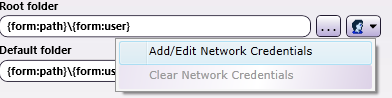
On the Network Credentials window, you can select your username and enter the appropriate password.
Note: Passwords will be stored in encrypted format with the workflow. If the expanded path is an absolute path, network credentials will be ignored when the workflow is running.
This field will also accept and store the username and password as part of the path name. For example, if you enter:
<file://test:test@servername/folder/user>, the username and password (test, test) will be used as the network credentials; in this case, any user-provided network credentials (entered on the Network Credentials window) will be ignored and the password will not be encrypted. -
In the Options area, you can do the following:
-
Uncheck the Enable Folder Search box to disable the default type ahead feature when searching for folders at the MFP panel.
-
Check the Show new folder box to allow the user to create a new folder on the MFP panel.
Note: This option is only available on MFPs running the Graphical User Interface (not Native).
-
Check the Show files box to display any files in the Root Folder.
-
Check the Show favorite folders box to display a list of favorite folders on the MFP panel. When you enable this option, the Favorite Folders area will no longer be grayed out. You can click on the + button in the Favorite Folders area, specify a “friendly name” that will be visible on the MFP panel, and then enter a folder path (or choose one using the ellipsis button) to specify favorite locations, as in the following illustration:
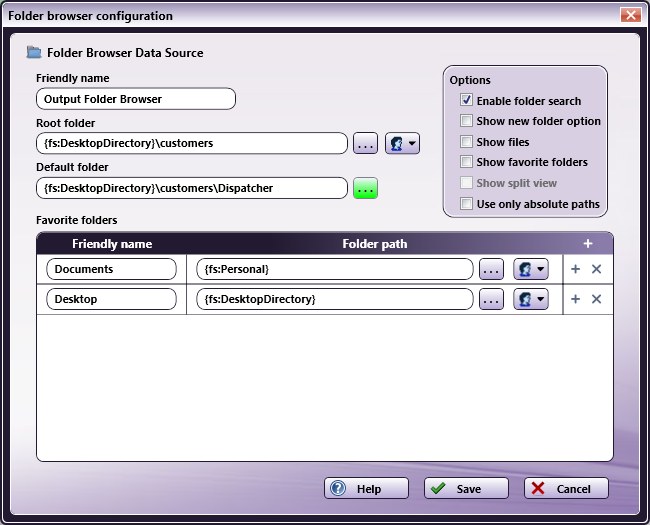
-
Check the Show split view box to display both the root folder and the favorite folders on the MFP panel. By default, if the Show favorite folders option is enabled, only the favorite folders are displayed.
-
By default, the {fs:DesktopDirectory} variable is used to indicate the Desktop in the Root Folder and Default Folder fields. To make sure that only full paths are specified so that the output location never changes per user, check the Use only absolute paths box.
Note: If there is only one folder browsing field on the page, then the results of the folder browsing query will be displayed automatically at the MFP panel. If there are multiple fields on the page, the user will be presented with a screen that lists the multiple fields.
Note: If the file or folder name is too long to fit the display, the name will be truncated.
-
Type Ahead Folder Searching at MFP
To provide a user-friendly experience and to save time while browsing through folders for a scan destination, Dispatcher Phoenix provides type ahead functionality for folder browsing at the MFP. For example, if a user needs to route a scanned file into a specific folder in a directory with thousands of different folders in it, the user could type in the first few letters of the folder name to filter the list of folders displayed.
Note: By default, only immediate children folders of the currently selected folder will be returned.
See the following illustrations for instructions on how to search for folders at the MFP:
-
On the main folder browsing screen, a Search field is provided for you to use to narrow the list of folders. You can enter text into this field. Then tap on the Search icon next to the field.
-
If text is entered, the Folder Search Results will return all folders that contain the specified text.
-
The search occurs from the directory you have selected (not the configured root directory).
-
A wildcard asterisk (*) can be used to represent more characters in a string of characters. For example, if entering inv* in the Search field, the folder results would display any folders that begin with those three letters (e.g., inv01, inv02, invoice, etc.). Or, if entering *inv in the Search field, the folder results would display any folders that end with those three letters (e.g., 01inv, 02inv, etc.)
-
A wildcard question mark (?) can be used to represent an arbitrary character. For example, if entering INV0? in the Search field, the folder results would display INV01, INV02, INV03, etc.
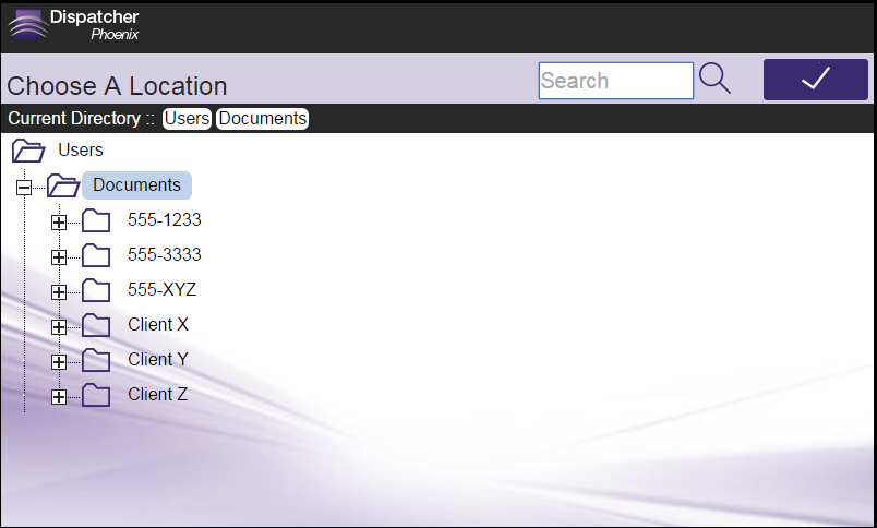
For example, in the following illustration, the user enters “555” in the Search field with the following results (only those folders with “555” in them are displayed).
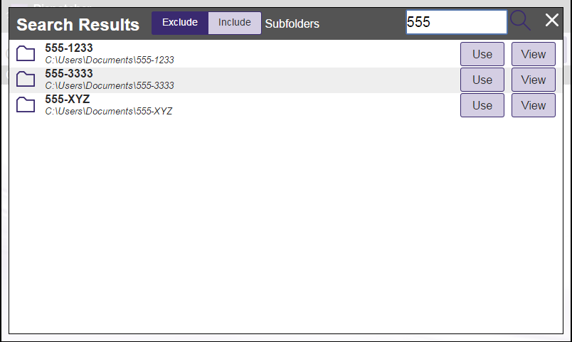
-
-
Once the folder list is filtered per your Search, you can do the following:
-
Tap on the Use button to select that particular folder.
-
Tap on the View button to return to a directory structure view of that particular folder.
-
Release the filter by tapping on the X button next to the Search field.
-
Include subfolder results in your filtered list by tapping on the Include Subfolders button.
-
Expand String Queries
With the Expand String Query, any folder paths that contain dynamic variables are automatically expanded to their actual values once the form loads on the MFP.
When you add an Output Folder workflow index field to your index form, the Expand String Query will be automatically added as part of the field’s configuration. In addition, a Set Value trigger is specified for the Output Folder’s variable name, as in the following illustration:
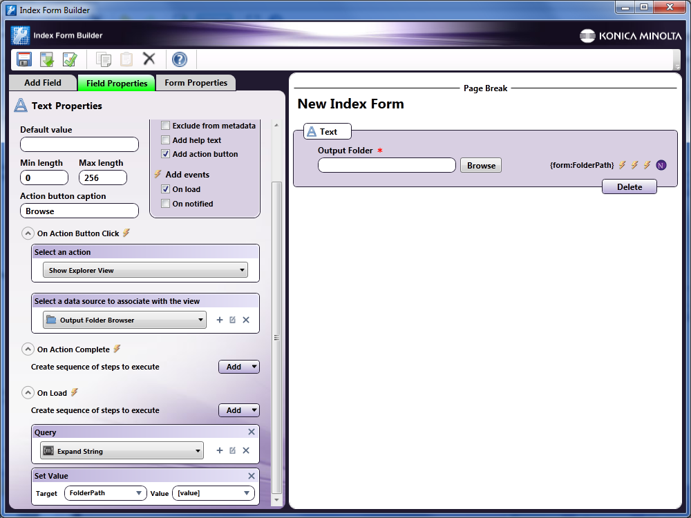
If you are adding a folder browsing query manually, you must do the following:
-
Add an On Load action.
-
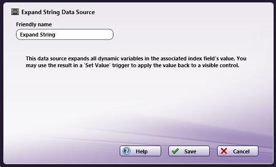
Specify an Expand String query by selecting Query from the Add button and then clicking on the + icon. Once selecting the Expand String Data Source option, the Expand string configuration window will appear, as in the following illustration:
-
Back on the Index Form Builder, add a Set Value trigger where the Target field is the variable name of the Output Folder and the Value is [value].
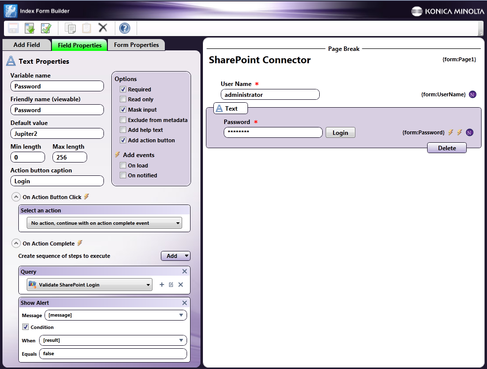
Validate SharePoint Login Example
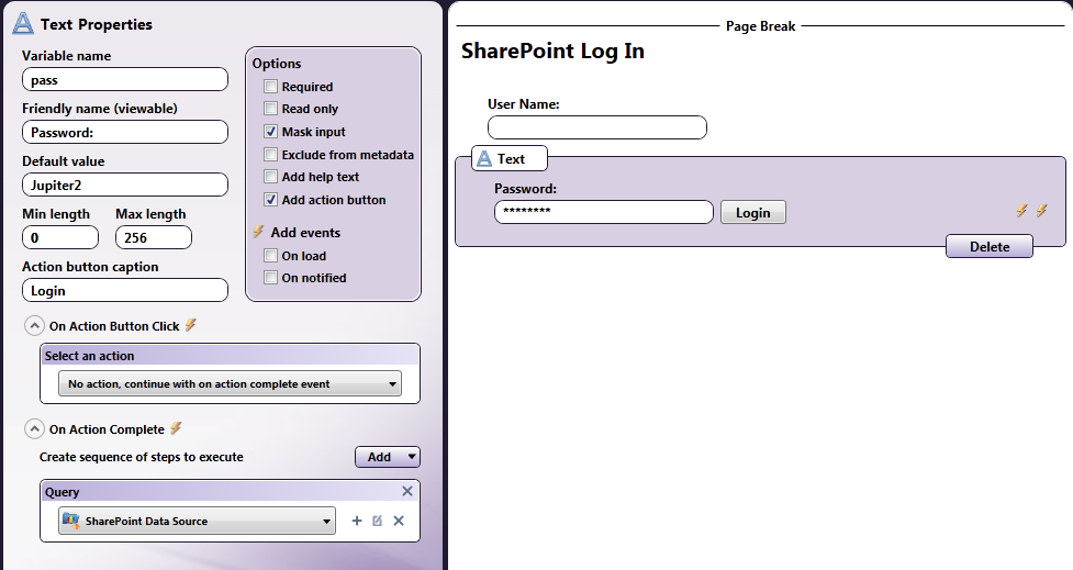
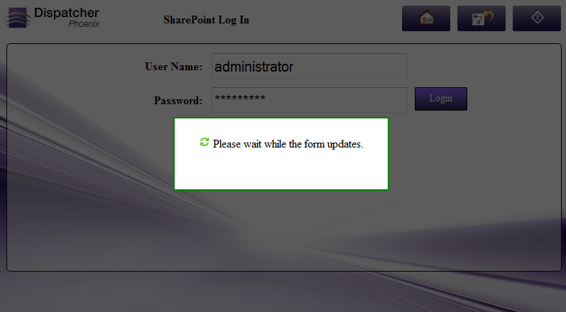
You can set up an index form that allows the user to log into SharePoint. Do the following:
-
Add one text field with a friendly name of “User Name.”
-
Add another text field with a friendly name of “Password.” Make sure this field has the “Mask Input” option enabled.
-
Associate an action button with the caption of “Login” with the Password field.
-
Configure the action button with an On Action Complete event that queries SharePoint with the Validate SharePoint Login action.
See the following illustration for an example:
At The MFP Panel:
At the MFP panel, the user would see the Login credentials fields. When a user name and password is entered, the index form would perform the Validate SharePoint Login action, as in the following illustration:
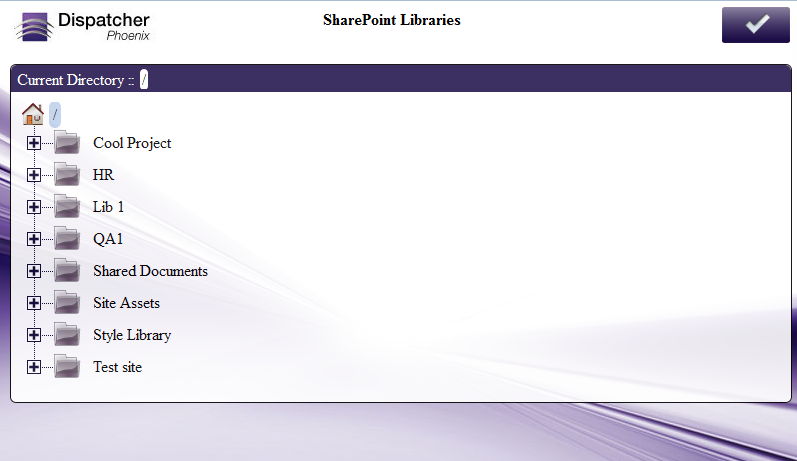
Get SharePoint Libraries/Folders Example
You could set up an index form to automatically display a Windows-Explorer like view of SharePoint libraries and folders.
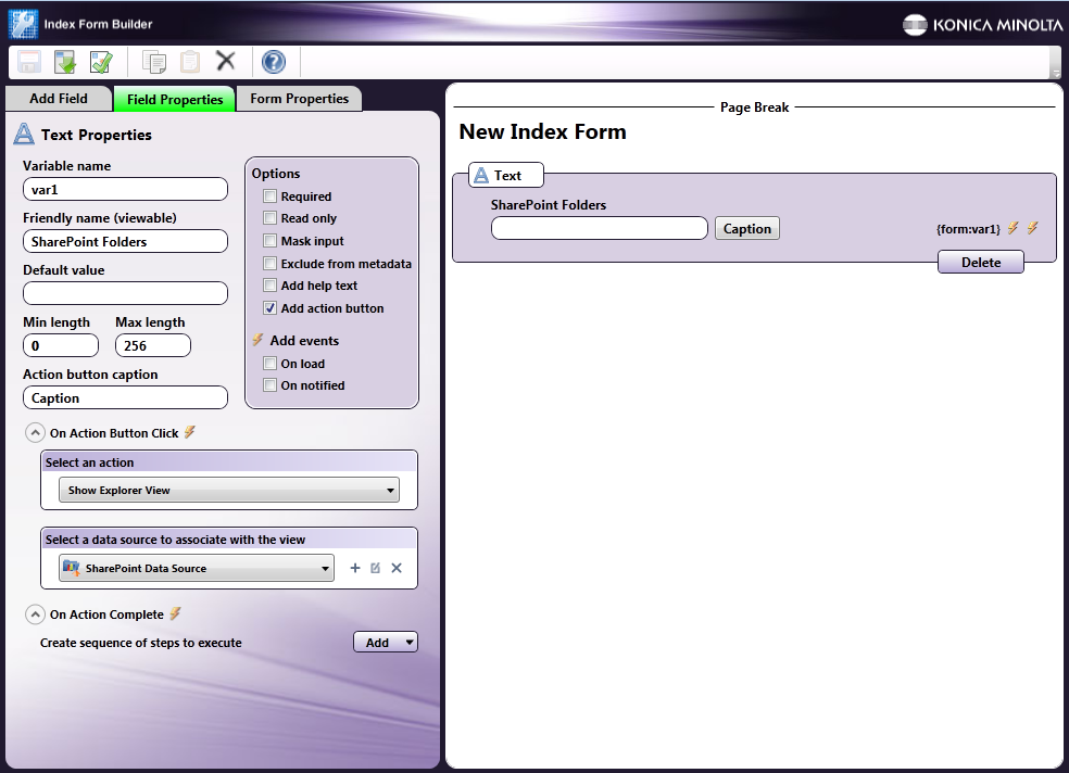
In this case, configure a text field with an action button that has the following properties:
-
On Action Button Click with an action of “Show Explorer View.”
-
Under the Select a data source to associate with the view, choose “SharePoint Data Source.”
-
On the SharePoint Data Source Configuration window, choose the “Get SharePoint Libraries/Folders” action.
See the following illustration:
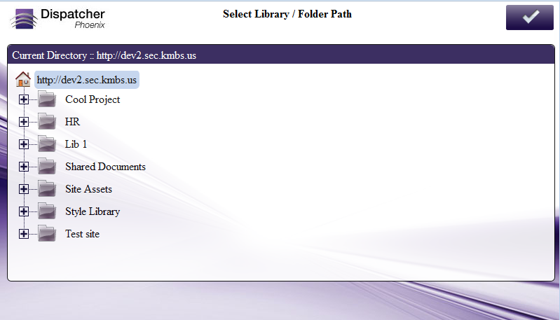
Note: Since you are only defining one Get SharePoint Libraries/Folders field on the page, then the results of the SharePoint Libraries/Folder retrieval will be displayed automatically. If there are multiple fields on the page, the user will be presented with a screen that lists the multiple fields.
At The MFP Panel:
At the MFP panel, the user would see the specific libraries and folders within the SharePoint site, as in the following illustration:
Defining a Set Value Trigger
Use the Set Value trigger to update a field based on what a user has selected or entered at the MFP. For example, you could use this trigger to populate a hidden field with a value that was selected from a list on the index form.
To define a Set Value trigger, do the following:
-
Choose Set Value from the Add button. An empty Set Value box will appear.
-
In the Target field, use the down arrow to choose from a list of variable names on the index form.
-
In the Value field, use the down arrow to choose from a list of column names that were returned from the query.
Important! When referencing columns in the data source, square brackets ([ ]) must be used around the column name. For example, if you need to access the ‘client’ column from the results of a SQL query, you must enter: [client]; if square brackets are not used, the text will be treated as static text.
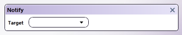
Defining a Notify Trigger
Use the Notify trigger to alert a field of another action. This notification will trigger the field to perform another action or series of actions.
To define a Notify trigger, do the following:
-
Choose Notify from the Add button. An empty Notify box will appear, as in the following illustration:
-
In the Target field, choose or enter the variable name of the field that you would like to notify. You can use the down arrow to choose from a list of variables in your form.
Defining a Set List Trigger
Use the Set List trigger to populate a drop-down list with the results of a query. To define a Set List trigger, do the following:
-
Choose Set List from the Add button. An empty Set List box will appear.
-
In the Target field, use the down arrow to choose the variable name of the drop-down list that you would like to update.
-
In the Label field, use the down arrow to choose from a list of columns returned from the query. The contents of the column that you choose will be displayed in the drop-down list.
-
In the Value field, use the down arrow to choose the value that needs to be associated with the label. The specified value can be used as a reference in other events within the form.
Important! When referencing columns in the data source, you must use square brackets around the column name. For example, if you need to access the ‘client’ column from the results of a SQL query, you must enter: [client]; if square brackets are not used, the text will be treated as static text.
-
To prepend the list with static text, check the Prepend static list options box. Then, in the Drop down list options area, enter your static text list item.
For Example (#1):
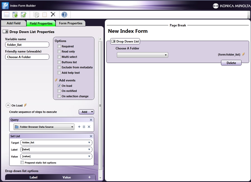
You can set up a folder browser to automatically populate a drop-down list with a list of folder path locations once the form is loaded on the MFP panel.
In this case, the drop-down list can be defined with the following attributes:
-
A variable name of ‘folder_list’ (by entering ‘folder_list’ into the Variable name field).
-
A label of ‘Choose a Folder’ (by entering ‘Choose a Folder’ into the Friendly name field).
-
An On Load event enabled (by checking the On Load box under the Add Events area).
-
A Folder Browsing query (by choosing Add > Query in the On Load section and then choosing Folder Browser Data Source). When setting up the Folder Browser configuration, make sure that the Show Files option is disabled.
-
A Set List event targeting the ‘folder_list’ field, which references the results of the folder browser query (by choosing Add > Set List in the On Load section). Use the ‘label’ and ‘value’ variables to populate the drop-down list with a list of folder paths returned from the Folder Browser query.
Note: When using this variable name, the full path of the folder will not be displayed, only the child folder name. To display the full path, you would have to add it as static text before the variable name when defining the Label in the Set List event.
See the following illustration:
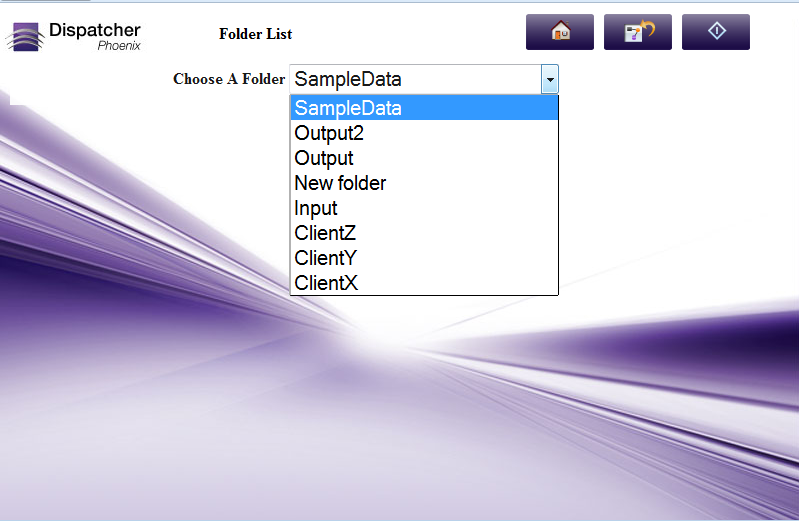
At The MFP Panel:
At the MFP panel, the user would see a drop-down list pre-populated with folder paths, as in the following illustration:
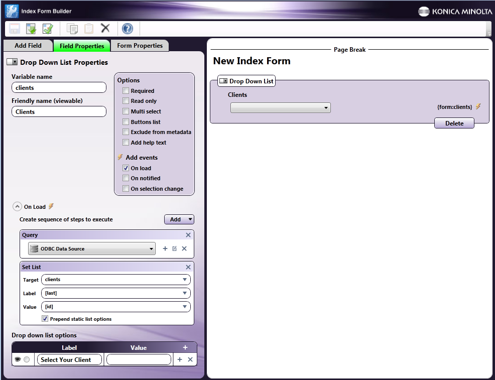
For Example (#2):
You can set up a drop-down list to include items of last names from a database query, with the static text of “Select Your Client” as the first item.
In this case, the drop-down list can be defined with the following attributes:
-
A variable name of ‘clients’ (by entering ‘clients’ into the Variable name field).
-
A label of ‘Clients’ (by entering ‘Clients’ into the Friendly name field).
-
An On Load event enabled (by checking the On Load box under the Add Events area).
-
An ODBC data source query (by choosing Add > Query in the On Load section and then choosing an ODBC data source).
-
A Set List event in which the drop-down list is populated with the results of the query and the Prepend static list options box is enabled.
-
A drop down list options item entered with the label of “Select Your Client” and an empty Value field, as in the following illustration:
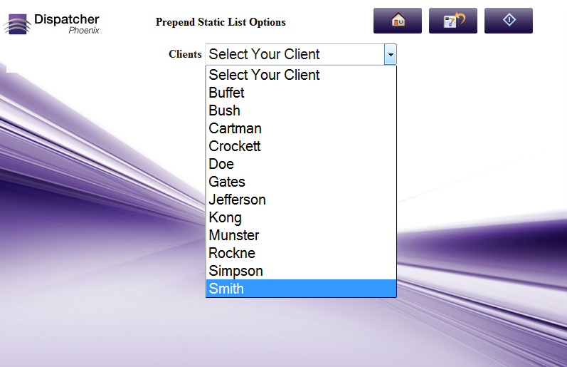
At The MFP Panel:
At the MFP panel, the user would see a drop-down list pre-populated with client names with the top item being “Select Your Client,” as in the following illustration:
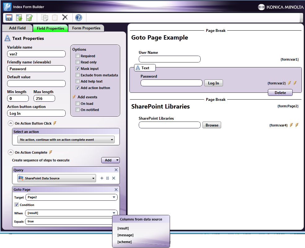
Defining a Goto Page Trigger
Use the Goto Page trigger to have another page in the index form automatically display after a specific event occurs. For example:
-
After the user makes a selection on the panel, the form automatically goes to a different page of the index form.
-
The user logs into a document management system, such as OnBase, and, once validation is successful, another page on the index form automatically appears.
To define a Goto Page trigger, do the following:
-
Choose Goto Page from the Add button. An empty Goto Page box will appear.
-
In the Target field, use the down arrow to choose the variable name of the page that you would like to go to.
-
To limit Goto Page to be triggered only when a specific condition is met, check the Condition box. Two additional fields will appear: When and Equals.
-
In the When field, use the down arrow to choose from a list of conditions returned from the data source query.
-
In the Equals field, enter the specific result for the condition in brackets.
For Example:
Set up an index form to go to the second page of an index form once the user has successfully logged into SharePoint at the MFP.
In this case, the index form would be set up with:
-
Log in fields configured with the Validate SharePoint login action.
-
A page break with the variable name of Page2.
-
An Explorer-like view of SharePoint libraries and folders.
-
A Goto Page trigger in which Page2 is displayed once validation is successful. Note that the Conditions box is enabled, and the When field returns [result], [message], and [scheme]. Choose [result] from the list.
See the following illustration:
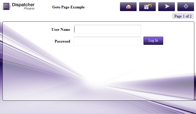
At The MFP Panel:
At the MFP panel, the user would see a login screen. Once the user enters the correct login credentials, the second page would automatically appear. See the following illustrations:
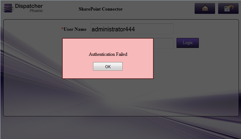
Defining a Show Alert Trigger
Use the Show Alert trigger to display an alert message automatically after a specific event occurs. For example, if login validation fails, an error message can be displayed. The message can either be pulled from the data source or entered directly into the Index Form Builder for display on the MFP.
To define a Show Alert trigger, do the following:
-
Choose Show Alert from the Add button. An empty Show Alert box will appear.
-
In the Message field, use the down arrow to choose from a list of column names returned from the data source query, or type the text that you want to appear in the alert box. To limit the Show Alert to be triggered only when a specific condition is met, check the Condition box. Two additional fields will appear: When and Equals.
For Example:
You can set up an index form to allow the user to log into SharePoint. If login is unsuccessful, you can display an alert message coming from SharePoint.
In this case, the index form would be set up with:
-
Log in fields configured with the Validate SharePoint login action.
-
A Show Alert trigger in which a message from SharePoint appears once login fails to validate. Note that the Conditions box is enabled, and the When field is specified with [message] which retrieves data from the message column in the data source.
See the following illustration:
At The MFP Panel:
At the MFP panel, the user would see the following message alert once invalid login credentials are entered:
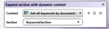
Defining an Expand SectionTrigger
To display dynamic fields from a data source such as OnBase, SharePoint, and Worldox define a placeholder using the Expand Section trigger.
To define an Expand Section Trigger, do the following:
-
Choose Expand Section from the Add button. An empty Expand Section box will appear.
-
Specify the content for the section by clicking on the + icon next to the Content drop-down list. You can get content from any data source, such as ODBC, OnBase, and SharePoint.
-
In the Section field, enter or choose the section in which you want the fields to appear.
For Example:
You can set up the index form to allow the user to display keywords from OnBase in another section of the index form based on the Document Type that was selected at the MFP. In the following example, the Expand Section box would be customized as in the following illustration: