Color Bar

Note: This node works with TIFF, JPG, PNG, BMP, and PDF files.
The Color Bar node is used to insert an image into a file.
- This node can be used to test the quality of a device’s ink color by verifying the real-time output of the inserted image.
- The node can also be used to insert an image like a Company Logo.
This process takes supported file format input and processes the input file based on the defined settings. During workflow execution, this node will insert/merge the thumbnail image(s) with the original input document. The files are merged and the output is sent to the next node in the workflow, the color processes intact.
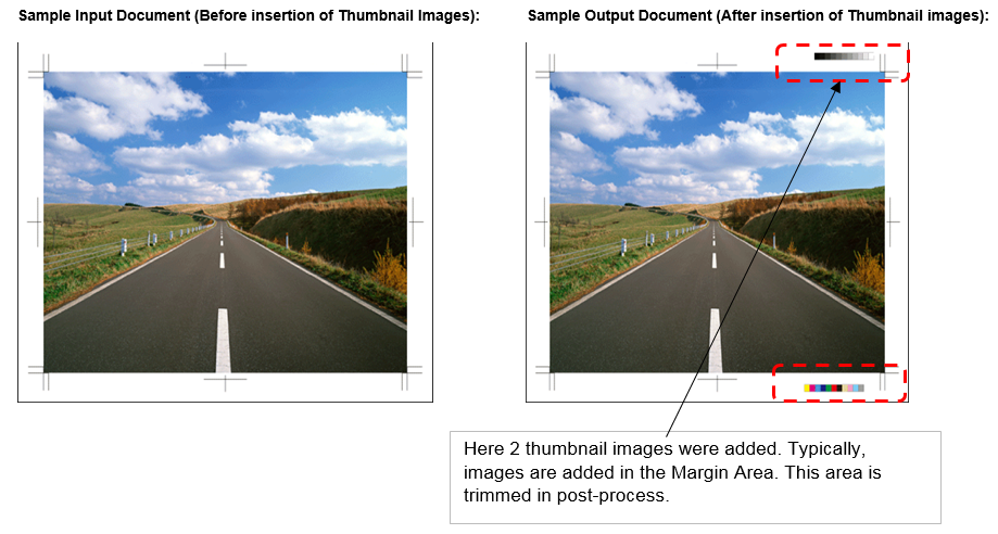
Note: The thumbnail image content overlaps the original document content in the output document.
Note: When one thumbnail image is placed over another thumbnail image, image overlap may occur.
Note: When the thumbnail image is bigger than the original document size OR if the thumbnail does not fit inside the original document, the image portion outside of the original document is cut and does not appear in the output document.
Note: When the Additional Thumbnail image is a TIFF or PDF with more than one page, only the first page will be inserted into the input document.
Note: When the thumbnail image is Color and the original document is B/W (Gray Scale/Monochrome), the output file defaults to B/W.
Using the Color Bar Node
Add the Color Bar Node to the workflow by dragging the node’s icon onto the Workflow Builder canvas, and then double-clicking on the icon to open the Color Bar Node’s window:
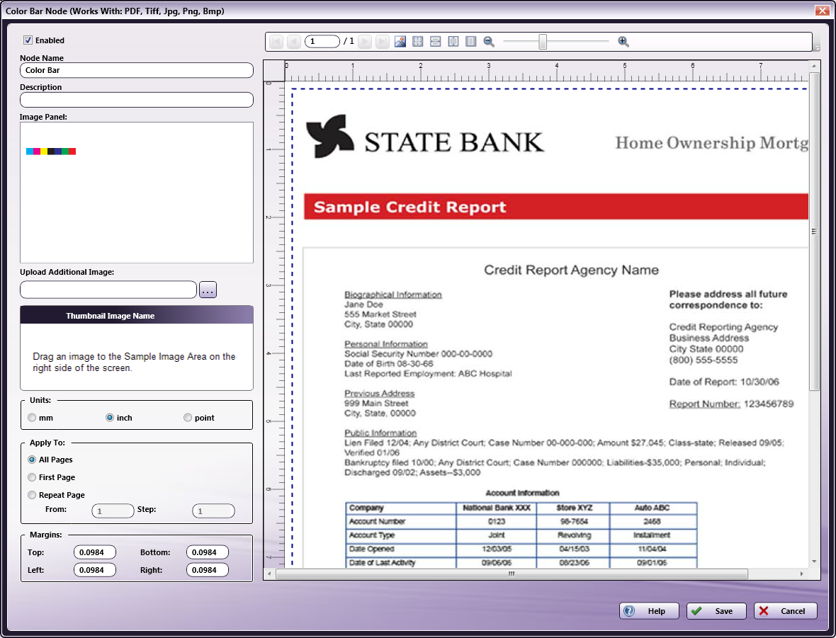
Use this window to specify the Color Bar Node’s settings.
-
Select the Enabled checkbox so that the process will run. When unchecked, this process is ignored. Documents pass through as if the node were not present (i.e., continue along the default or positive path). Note that a disabled node will not check for logic or error conditions.
-
In the Node Name field, enter a meaningful name for the Color Bar Node.
-
In the Description field, enter a description for the Color Bar Node. This is not required, but can be helpful with multiple collection points. If the description is long, hover the mouse over the field to read its entire contents.
-
Click the Save button to save the changes. If Cancel is selected and the window is closed, the changes are not saved.
-
Click the Help button to access online help.
Insert Image
Image Panel
The Image Panel displays the default images and any additional uploaded images. Use the ellipses (…) button to browse and upload additional images. A maximum of 256 images is supported.
Note: All images are common for all users and workflows.
Any of the following image file formats may be uploaded to the node:
- TIFF, JPG, PNG, BMP, and PDF
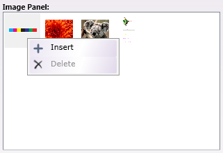
Drag-and-drop an image from the Image Panel to the Sample Preview Panel. Once the image displays in the Sample Preview Panel, Move, Resize, and Rotate operations may be applied to the image. Images moved to the Sample Preview Panel are inserted into the input document.
An image may also be inserted into the Sample Preview Panel using the Insert option, the action accessible via the right-click context menu.
An image may be deleted from the Image Panel by right-clicking on it and then selecting Delete from the context menu. The Delete is only applied by clicking the Color Bar Node’s Save button. If the node’s Cancel button is clicked after a Delete operation, the Delete is NOT applied and the deleted setting remains in the Image Panel. When an image is deleted, the image is removed from its original location, the path selected when the image was uploaded to the Color Bar Node.
Note: Default images cannot be deleted. When a default image is selected, the Delete option is disabled.
Thumbnail Image Name
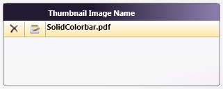
The Thumbnail Image Name panel lists the names of all the images displayed in the Sample Preview Panel. Select an item in the Thumbnail Images list, the corresponding thumbnail image will be selected in Sample Preview Panel and vice-versa.
Edit the Thumbnail Image using the Edit icon to the left of the file or by double-clicking on the image in the Sample Preview Panel. The Edit screen opens:
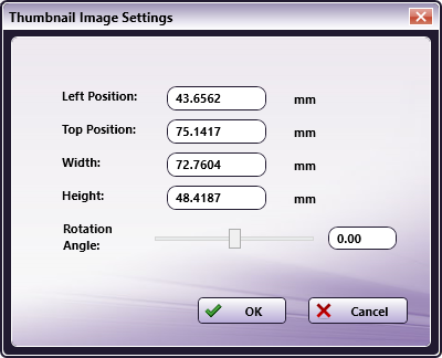
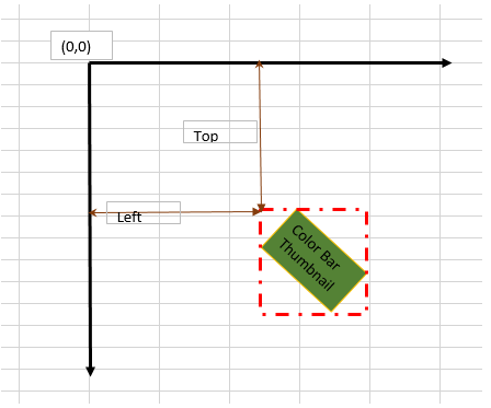
- In the Thumbnail Image Settings window, specify the Left and Top Positions, and the Width, and Height of the image. The Left and Top positions of the bounding rectangle are as noted in the image that follows:
-
Use the slider to automatically change the Rotation Angle or enter a precise value in the text field. Supported values are -360 - 360. If a numeric value outside the range is entered, the value defaults back to 0 degrees.
-
An image may be deleted from the Thumbnail Image Name panel by using the Edit icon to the left of the file. A verification pop-up opens. Click OK to Delete the Thumbnail Image Name or Cancel to cancel the request.
Note: When a value is left blank, the option resets to the previous value once the screen is closed.
Note: If the Thumbnail Image Name is changed, this will only affect the Name displayed by the node. It does not change the file name in the ThumbnailImages folder.
Units
In the Units panel, select a measurement unit radio button. Three types of measurement units are available: mm, inch, and point
Note: By default, inch displays for all English locale systems. All other locales default to mm. Regardless of the default value, any of the available three values may be selected. Whenever the unit value is changed, it is applied throughout the application.
Apply to Setting
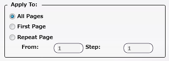
Choose one of the following options to specify where the image should be inserted:
-
All Pages: The image is inserted in all pages of the Input document.
-
First Page: The image is only inserted on the first page of the Input document.
-
Repeat Page: The image is inserted based on the From and Step values.
-
From: For example, if the From value is 4 and the Step value is 6, then images are inserted at Pages 4, 10, 16, 22, etc.
-
Step: This is only enabled when the Repeat Page option is selected.
-
Margins
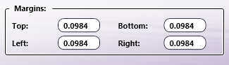
Use the Margins settings to preview the alignment of input files. There are four values that may be specified: Top, Bottom, Left, and Right. These margins are only for visual reference and do not affect the printed document. Based on the values set, the Margins (dotted lines) are updated in the Sample Preview Panel.
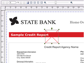
Sample Preview Panel
The Sample Preview Panel provides a preview of the output file. Supported file types are TIFF, JPG, PNG, BMP, and PDF. The maximum dimension supported is 330.2 x 1200.0 mm. Only one image may be loaded at a time.
To load an image, drag-and-drop a single image from the Image Panel to the Sample Preview Panel. A maximum of 4 images may be dropped into the Sample Preview Panel.
Images may also be inserted to the Sample Preview Panel using the Insert option from the right-click context menu. When Insert is used, the image is inserted into the Sample Preview Panel and placed at the Left=0, Top=0 coordinates. The images added to the Sample Preview Panel also appear in the Thumbnail Image List.
If a portion of an image is outside of the Sample Preview Panel, it is not shown. If the entire image is outside of the Sample Preview Panel, then the whole image is not shown and the image cannot be selected.
Once the image is added to the Sample Preview Panel, the following operations may be applied: Copy, Move, Rotate, Resize, View, Edit, and Delete.
-
Copy/Paste
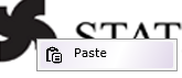
- Use the right-click context menu to apply Copy and Paste operations to a thumbnail image inside the Sample Preview Panel. When Copy is clicked, the settings of the current image are copied. When the Paste is clicked, the copied image is pasted in the selected position.
-
Move
-
Select the image then use the ALT + ARROW keys, or select the image and then use the mouse to move the image inside the Sample Preview Panel.
-
In the Thumbnail Image Name window, double-click on a thumbnail image and the settings screen opens. Enter values in the Top and Left fields. The image in the Sample Preview Panel is moved to the location specified by the two values.
-
-
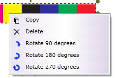
Rotation
-
Use the right-click context menu to rotate the thumbnail image by 90, 180, or 270 degrees.
-
Use the mouse to rotate an image.
-
In the Thumbnail Image Name window, double-click on a thumbnail image and the settings screen opens. Use the slider or enter numeric values. Enter values in the Top and Left fields. The image in the Sample Preview Panel is moved to the location specified by the two values.
-
-
Resize
-
Click on an image and drag the corners or edges to resize the image.
-
Select the image then use the ALT + SHIFT + ARROW keys to resize the image.
-
In the Thumbnail Image Name window, double-click on a thumbnail image and the settings screen opens. Enter values in the Width and Height fields.
-
-
View/Edit
- Double click on the thumbnail image or click the Edit icon in the Thumbnail Images List to View/Edit properties.
-
Delete
- Click on one or more images to select them, and then use the Delete key or the context menu’s Delete option. To select multiple items, click on a thumbnail image then press the CTRL key.
If a Preview image has not been added, a default image displays in the Sample Preview Panel.
If any error occurs when uploading a preview image, a default image displays in the Sample Preview Panel.
When an added thumbnail image is deleted, an X cross-mark displays to show the previous location of the deleted image, as noted in the example that follows:
If the node setting’s Save button is clicked and the node cannot locate an added Thumbnail Image, the following notification pop-up opens:
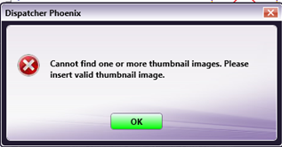
Click OK to close the pop-up.
Tool Bar
The Toolbar is at the top of the window. Use it to customize the Preview.
| Tool Bar Icons | Description |
|---|---|
 |
Upload icon. Click on this icon to upload sample preview panel image. |
 |
Pages icons. Click on the arrows to navigate through multiple pages of the sample document (if available). |
 |
Actual Size icon. Click on this icon to revert the preview sample document to its original size. |
 |
Fit to Width icon. Click on this icon to stretch the sample document to fit the width of the Preview area. |
 |
Fit to Height icon. Click on this icon to stretch the sample document to fit the height of the Preview area. |
 |
Fit to Page icon. Click on this icon and the sample document fills the Preview area. |
 |
Zoom controls. Use either the magnifying glass icons or the sliding bar to zoom in and out of the Preview area. |
Limitations
Important!
-
Only the following format combinations support transparency:
- The Input file and the Image Panel are both PDFs. (The Sample Preview Panel will not match the output in this case. In areas where transparency is applied in the output file, white area(s) are instead displayed in the Sample Preview Panel.)
- The image Panel is TIFF or PNG and the input file is TIFF, JPG, PNG, BMP format. (In case input file is PDF, transparent information is lost)
-
When the workflow contains a PDF-type thumbnail image with a transparent background, the Sample Preview Panel displays a white background but in the output PDF, the image is inserted against a transparent background.
-
Combining a PDF Input file with a TIFF transparency in the Image Panel will generate a processing error.